
Why Lighting and Color Consistency Matter for Artwork Photography
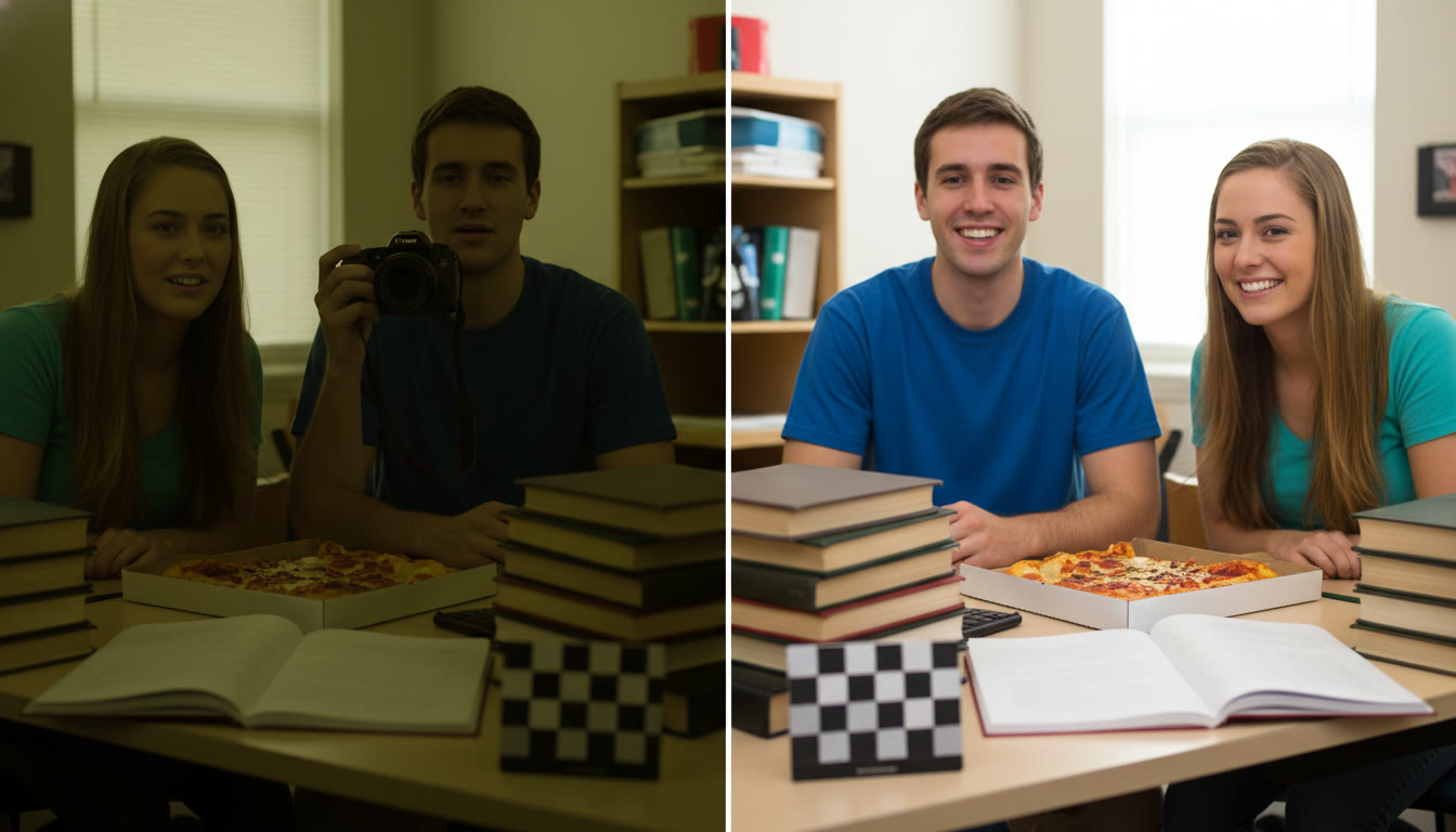
Photographing artwork isn’t just about pointing a camera and clicking. Whether you’re assembling an AP Studio Art portfolio, documenting a class project, or preparing pieces for an online gallery, lighting and color consistency are what make your work reproduce honestly and professionally. Colors that shift between photos, shadows that hide detail, or highlights that blow out texture can all undermine the viewer’s trust in the work and the story you’re trying to tell.
This guide walks you through the essentials—what to control, why each choice matters, and how to build repeatable setups. I’ll give practical examples and a few short tables for quick reference, plus creative tips to help your documentation stand out while staying accurate. If you want one-on-one help tailoring this to your AP portfolio or camera gear, Sparkl’s personalized tutoring can offer tailored study plans, expert tutors, and AI-driven insights to speed up your learning curve and refine your images.
Core Principles: Light, Color, and Consistency
1. Control Your Light Source
Natural light is beautiful but unpredictable. For reliable results, especially across multiple shooting sessions, use continuous artificial lighting. If you must use daylight, choose a single consistent window, shoot at the same time of day, and diffuse the light with a curtain or scrim.
- Continuous vs. flash: Continuous lighting (LED panels, softboxes) lets you see the effect in real time and works well for small studios or dorm-room setups. Flash can be powerful and color-stable but requires sync and modifiers.
- Diffuse the light: Hard light creates specular highlights and deep shadows—diffusers or softboxes produce soft, even illumination that reveals texture without harsh glare.
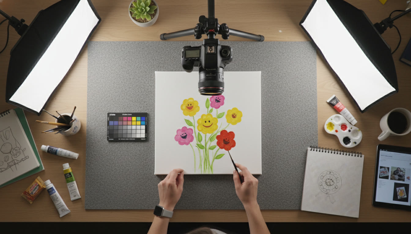
- Angle matters: Standard practice is two identical lights at 45 degrees to the artwork to evenly illuminate the surface and reduce distracting reflections.
2. Keep Color Temperature Steady
Light has color temperature—measured in Kelvins—and mixing different temperatures (like window light and warm indoor bulbs) will result in color shifts. Choose one light source type and stick with it for the entire shoot. If your lights are adjustable, set them to a stable Kelvin value (e.g., 5000–5500K for neutral daylight balance) and keep that setting across sessions.
3. Reference Standards—Color Targets and Gray Cards
Always include a neutral gray card or a color checker in at least one test shot. These tools are lifesavers when correcting color in post. Photograph the card under the same lighting and use it as a baseline for white balance and color adjustments later.
Practical Setup: Equipment and Placement
Minimal Gear List (Student-Friendly)
- Camera (any DSLR, mirrorless, or a high-quality phone in manual/photo mode)
- Tripod—stable and tall enough to center the artwork in your frame
- Two identical continuous lights (softboxes or LED panels)
- Neutral gray or color checker card
- Neutral background (neutral gray foam board or matte white)
- Clamps or easel to hold artwork steady
Step-by-Step Placement
Set up the artwork on an easel or flat on a table with a neutral background. Position two lights at 45-degree angles from the plane of the artwork, slightly above center, so the light washes down evenly. If the piece is glossy or has varnish, raise the lights and increase the angle to reduce specular highlights showing in the camera.
- Camera center: place the camera exactly centered on the artwork’s midline and set it parallel to the work plane. Use a bubble level or grid to ensure the image isn’t skewed.
- Distance: move the camera far enough away to minimize perspective distortion—use a focal length that captures the artwork without wide-angle distortion (for APS-C sensors, typically 35–70mm equivalent; for full-frame, 50–105mm works well).
- Height: align the lens with the center of the artwork to avoid vertical keystoning.
Camera Settings for Accurate Reproduction
Manual Control vs. Auto Modes
Manual mode is your friend here. Auto white balance and exposure can drift between shots. Choose manual exposure and a fixed white balance (or use a custom white balance from your gray card shot).
Recommended Starting Settings
| Parameter | Suggested Setting | Why |
|---|---|---|
| Mode | Manual (M) | Ensures consistency across shots |
| ISO | 100–200 | Lowest possible to minimize noise |
| Aperture | f/5.6–f/11 | Sharp across the plane without diffraction |
| Shutter Speed | Use to balance exposure (typically 1/60–1/200 with continuous light) | Set according to light output; tripod removes motion worries |
| White Balance | Custom (from gray card) or fixed Kelvin (e.g., 5200K) | Prevents color drift in mixed lighting |
| File Format | RAW | Retains maximum color and tonal data for editing |
RAW files give you the most latitude to correct color and exposure in post. If you must shoot JPEG (limited storage or quick turnaround), set the camera to the most neutral picture profile and avoid in-camera processing like saturation boosts.
Dealing with Challenging Surfaces
Glossy and Reflective Works
Reflections are the enemy of faithful documentation. To minimize them:
- Increase the angle between the light and the camera (lights more to the sides, camera straight on).
- Use polarizing filters on the camera lens to cut reflections (note: polarizers also reduce light—adjust exposure accordingly).
- Try cross-polarization if you have two polarizers: one on the lights and one on the lens—this can eliminate specular highlights while preserving color and texture.
Textured and Three-Dimensional Pieces
Texture is often part of the artwork’s intent. For sculptural works or impasto paintings, light direction can emphasize or reveal tactile detail.
- Use raking light (light at an acute angle) to emphasize texture, then supplement with frontal soft light for even color capture.
- Capture multiple angles—front-facing shot for color, angled shot for texture.
Color Management Workflow
1. Calibrate and Profile Your Monitor
Color accuracy doesn’t stop at the camera. If you edit on a monitor that’s uncalibrated, your corrected colors won’t be accurate when printed or viewed on other devices. Use a hardware colorimeter and create a profile for your monitor under the ambient lighting conditions of your workspace.
2. Use Your Gray Card and Color Checker
In post, open your RAW file and apply a white balance using the neutral gray patch. If you shot a color checker, use its patches to create a camera profile or to precisely correct skin tones and neutrals.
3. Keep Edits Minimal for Documentation
If your goal is faithful documentation (e.g., AP portfolio images), avoid heavy color grading. Adjust exposure and white balance, correct minor contrast and sharpening, and save a master file in a non-destructive format. For creative reproductions or promotional images, you can apply more style—but keep an archival copy that remains true to the original.
Quick Troubleshooting: Common Problems and Fixes
| Problem | Likely Cause | Quick Fix |
|---|---|---|
| Color shift between sessions | Different light sources/white balance | Use same lights and custom white balance or include gray card each session |
| Reflection on varnished painting | Light angle too close to camera view | Move lights wider or use polarizer/cross-polarization |
| Uneven exposure across artwork | Lights at different intensities or distances | Measure and match light output; use a light meter or adjust power settings |
| Apparent loss of contrast on monitor | Monitor not calibrated | Calibrate monitor; check in multiple viewing environments |
Examples and Mini Case Studies
Case 1: Watercolor on Cold-Press Paper
Watercolor often has subtle washes and paper texture that can be lost with aggressive light. Soft, even lighting at 45-degree angles keeps washes visible without flattening the paper grain. Use a neutral background and a low-contrast RAW profile, then slightly boost clarity to reveal paper texture if needed.
Case 2: Oil Painting with Varnish
For varnished oils, aim to remove specular highlights. A slightly higher light angle and polarizing filters will help. If you want to show texture, include a secondary angled shot with raking light as a separate image in your portfolio.
Case 3: Mixed-Media Collage with Metallic Elements
Metallic pieces can blow out. Reduce light intensity, increase distance, and use reflectors to fill shadows rather than adding direct light. Capture multiple exposures if needed and blend carefully in editing to preserve both metallic sheen and shadow detail.
Organizing and Naming Files for Portfolios
Consistent file naming and a clear folder hierarchy will make your life easier when submitting AP portfolios or preparing presentations. Consider a structure like:
- CourseYear_ProjectName_Version (e.g., 2025_StudioArt_Series1_Raw)
- Include metadata: embed the piece title, dimensions, medium, and creation date in the file’s metadata so reviewers can see the details without needing separate files.
How to Practice: Assignments to Build Skill and Confidence
Photography skills improve with structured practice. Here are three short assignments you can repeat with different media to master lighting and color consistency.
- Assignment 1 — The Neutral Shot: Photograph a small painting under two identical lights with a gray card. Create a RAW edit that matches the physical piece. Compare with peers or your teacher and note any differences.
- Assignment 2 — Texture Study: Create two images of the same piece: one with soft frontal light and one with raking light to exaggerate texture. Write a short paragraph describing when each approach is appropriate.
- Assignment 3 — Color Calibration: Take the same piece into three different rooms (window light, tungsten, LED). Photograph with gray card and correct each file using the same monitor profile. Observe the differences and make a checklist for future shoots to maintain consistency.
When to Get Help: Sparkl’s Personalized Tutoring
Photography and documentation can be technical—especially when you’re aiming for portfolio-level accuracy. Sparkl’s personalized tutoring offers 1-on-1 guidance and tailored study plans that can help you implement the setups described here. Their expert tutors can review your test shots, recommend gear that fits your budget, and use AI-driven insights to speed up color correction workflows. If your AP portfolio is on the line, that targeted feedback can be a game-changer.
Checklist: One-Page Reference for Shoot Day
| Task | Done? |
|---|---|
| Set up lights at matching Kelvin and power | [ ] |
| Mount artwork parallel to camera | [ ] |
| Center camera and level lens | [ ] |
| Shoot gray card and color checker | [ ] |
| Shoot RAW and bracket exposures if needed | [ ] |
| Label and back up files immediately | [ ] |
Final Thoughts: Balancing Accuracy and Creativity
Documenting artwork faithfully is a discipline that supports your creative work—it doesn’t constrain it. Accurate reproduction preserves your intent and gives reviewers, buyers, or viewers confidence in what they see. Once you’ve mastered consistent lighting and color, you can use those skills creatively to produce promotional images or interpretative photographs that enhance the narrative around your work.
Remember: start simple, build a reliable setup, and iterate. Test, compare, and keep records of your lighting positions and settings so you can reproduce the look later. If you ever feel stuck, personalized tutoring—like Sparkl’s 1-on-1 sessions—can help you troubleshoot specific problems, refine your workflow, and make your portfolio shine.
Parting Tip
One clean, calm, consistent image that represents the piece accurately is better than ten dramatic images that misrepresent the work. Trust the work—and the process—and your documentation will reflect that confidence.
Resources to Consider Next
Practice the setups above, compare your edits on multiple devices, and consider scheduling a short critique session—either with your instructor, classmates, or a tutor—so you get fresh eyes on your images and can keep improving.


No Comments
Leave a comment Cancel