Introduction: Why Data Management Matters for Student Research
If you’re preparing an AP research project, an AP Capstone submission, or any data-driven investigation, strong data management is the difference between a convincing final paper and a chaotic, hard-to-defend experiment. Think of your data as an asset: like notes, citations, and lab results, it deserves structure, traceability, and care. This blog walks you through practical, student-friendly ways to use spreadsheets and repositories so your research stays clear, reproducible, and impressive.

Part 1 — Spreadsheets: The Everyday Power Tool
Why spreadsheets are often your best starting point
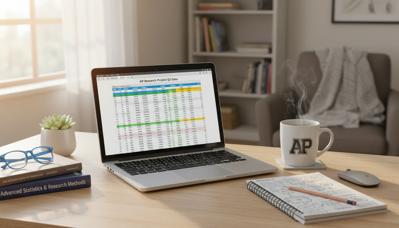
Spreadsheets are approachable, visual, and widely supported. Whether you use Excel, Google Sheets, or another tool, spreadsheets let you enter raw data quickly, perform calculations, create charts, and prepare tables for reports. For many AP-level projects, a well-structured spreadsheet handles everything from surveys to experimental measurements.
Spreadsheet design principles
Before you start entering numbers, take two minutes to think about layout. A clear design reduces errors and makes it easier to export or import data later.
- One dataset per sheet: Keep distinct experiments, survey rounds, or instruments on separate tabs.
- Column-first approach: Each column = one variable (e.g., Date, ParticipantID, Score).
- Use a header row: Include a short variable name and a description in the row beneath the headers when helpful.
- Consistent data types: Dates in date format, numbers as numeric types, categorical values as consistent short labels.
- Record units and provenance: If a column is “Weight (g)”, put the unit in the header. If measurements came from Device A, note that in a metadata cell.
Common spreadsheet workflows for research
Here are practical workflows you’ll likely use as a student researcher:
- Data entry & validation: Enter raw responses in a sheet called Raw_Data. Use data validation rules to restrict entries (drop-down lists for categories, date pickers for dates).
- Cleaning & transformations: Create a second sheet called Clean_Data where you apply filters, remove duplicates, and standardize text.
- Analysis-ready datasets: Build a Final_Data sheet with the exact columns you’ll analyze. This reduces errors when copying into statistical tools or creating charts.
- Versioning: Save dated copies or use cloud revision history. Add a small ‘changelog’ sheet that notes major edits and dates.
Practical tips for avoiding errors
Small mistakes in spreadsheets can wreck your conclusions. Spot-check frequently and adopt habits that reduce slip-ups.
- Avoid merged cells in data regions — they break filters and exports.
- Lock or protect header rows and formulas so they aren’t accidentally overwritten.
- Use conditional formatting to highlight outliers or missing values.
- Make a habit of adding an explicit “NA” or blank logic for missing values and document how you handle them.
Example: From survey responses to analysis-ready table
Imagine you ran a 100-student survey measuring study hours and self-reported stress (Low, Medium, High). Your sheets might look like:
| Sheet | Purpose | Example Columns |
|---|---|---|
| Raw_Data | Original survey export | Date, RespondentID, Hours_Studied, Stress_Text, Notes |
| Clean_Data | Standardized values | Date, RespondentID, Hours_Studied (num), Stress (Low/Med/High), Completed (Yes/No) |
| Final_Data | Ready for charts/stats | RespondentID, Hours_Studied, Stress_Level, Age_Group |
This separation keeps raw responses intact while you correct typos, normalize text like “low” vs “Low”, and handle missing answers consistently.
Part 2 — Repositories: Safe Storage, Versioning, and Collaboration
What is a repository and why use one?
A repository is a structured place to store project files — code, data, documentation — with version control. Repositories protect your work against accidental deletion, record changes over time, and make collaboration smoother. For student researchers, repositories are ideal for preserving reproducibility: graders, teachers, or collaborators can see exactly how a dataset or analysis evolved.
Types of repositories students commonly use
- Cloud storage with version history (Google Drive, OneDrive): Easy for beginners, with automatic backups and simple sharing.
- Research-oriented repositories (institutional or public archives): Useful for final dataset deposits when you want a DOI or formal record.
- Code repositories with version control (git-based): If you use code (Python/R/Julia) for analysis, a git repository is excellent for tracking changes to scripts and notebooks.
Repository best practices for research projects
Whether you use a simple cloud folder or a git repository, adopt these practices so your project remains organized and trustworthy:
- Keep a consistent folder structure: e.g., /data/raw, /data/clean, /scripts, /figures, /docs.
- Include a README: One short file that explains the project purpose, folder layout, and how to reproduce key steps.
- Write a data dictionary: Describe each column, units, and acceptable values so future readers (or graders) understand your variables.
- Tag major milestones: Use commit messages, or save milestone copies like v1-cleaning, v2-analysis to indicate when big changes occurred.
- Archive raw data: Never overwrite original files. If you must transform them, write instructions and save a copy under /data/raw with a date stamp.
Simple folder structure example
| Folder | Contents | Why |
|---|---|---|
| /data/raw | Original CSVs or survey exports | Preserve originals for audit and reprocessing |
| /data/clean | Cleaned spreadsheets, standardized variables | Used directly for analysis |
| /scripts | Analysis scripts or formula notes | Documented steps to reproduce results |
| /figures | Charts and images | Ready for inclusion in reports |
| /docs | README, Data Dictionary, Consent Forms | Context and ethical documentation |
Part 3 — Reproducibility: From Spreadsheet to Published Result
Document every step
Reproducibility is a core principle of good research. That means anyone with access to your files should recreate your figures and statistics. Two simple habits dramatically improve reproducibility:
- Save the code or formulas you used to create each chart — don’t rely on manual edits.
- Keep a log of decisions: why you removed outliers, how you aggregated categories, and which statistical tests you used.
When to move from spreadsheets to code
Spreadsheets are powerful, but if your dataset grows or you need repeatable transformations, consider learning a small amount of code (Python with pandas or R with tidyverse). Even basic scripts can:
- Automate cleaning steps so you don’t repeat them manually.
- Create reproducible plots and tables that are consistent across drafts.
- Make it easier to collaborate: scripts are transparent and can be run on any machine with the right environment.
Part 4 — Common Student Scenarios and How to Handle Them
Scenario 1: Inconsistent date formats
Problem: Your survey export mixes formats like 10/07/2024 and 2024-10-07. Fix: Convert to a single standard (ISO 8601, YYYY-MM-DD) and create a column “Date_Clean” using a consistent parser or spreadsheet DATE functions. Document the conversion step in your README.
Scenario 2: Missing values in the middle of analysis
Problem: Some respondents skipped a question, leaving blanks. Fix: Decide on an approach and be transparent — remove incomplete cases, impute values with medians, or analyze with methods that handle missingness. Record what you did and why.
Scenario 3: Multiple collaborators editing the same spreadsheet
Problem: Changes overwrite one another. Fix: Use cloud platform version history and assign ownership of specific sheets; or download and run merges weekly. For heavier collaboration, use a repository and share scripts rather than live-editing raw data.
Part 5 — Practical Checklists for AP and Capstone Students
Before you collect data
- Create a data management plan: where files will live, who has access, naming conventions.
- Prepare consent forms or anonymization plans if collecting human-subject data.
- Build the blank spreadsheet template with headers and validation rules.
After you collect data
- Save raw exports unmodified under /data/raw with a date-stamped filename.
- Document any immediate corrections (typos, broken entries) in a Changelog.
- Produce a clean copy and create a data dictionary file in /docs.
Part 6 — Examples, Comparisons, and Real-World Context
Example: Analyzing study habits
Compare two simple approaches for the same question: “Do students who study longer report lower stress?”
| Approach | Pros | Cons |
|---|---|---|
| Spreadsheet-only | Fast to implement, visual, no coding needed | Harder to reproduce precisely, error-prone for many transformations |
| Scripted workflow (code + repo) | Fully reproducible, easier for repeated analyses | Steeper learning curve, needs minimal coding skills |
As a student, you can blend both: collect and initially clean in a spreadsheet, then write a short script to perform final aggregations and plots. This hybrid approach gives speed and reproducibility.
Real-world context: Why professionals use these habits
Researchers, data journalists, and industry analysts use the same core ideas — separate raw and clean data, version control, and explicit documentation — because their work is often audited, reused, or extended. Practicing these methods in your AP project makes your work look mature and can be a powerful talking point in presentations or interviews.
Part 7 — Tools and Small Investments That Pay Off
Low-friction tools for students
- Cloud spreadsheets for collaboration and revision history.
- Simple git GUI clients (if you try version control for scripts).
- Notebook environments (like Jupyter) to combine code, outputs, and explanations in one place.
When tutoring or coaching helps
If you’re preparing a major AP submission and want focused feedback, personalized tutoring can accelerate learning. For example, Sparkl’s personalized tutoring offers 1-on-1 guidance, tailored study plans, expert tutors, and AI-driven insights that help students design data workflows, clean datasets, and prepare reproducible analyses. A short tutoring session can translate spreadsheet habits into a clean, defensible research pipeline — saving time and improving your final presentation.
Part 8 — Putting It Together: A Mini Roadmap for a 6-Week Project
Here’s a simple timeline for students doing a time-limited research project.
| Week | Focus | Deliverable |
|---|---|---|
| Week 1 | Project design and data plan | Template spreadsheet, README, consent forms |
| Week 2 | Collect data | Raw exports saved under /data/raw |
| Week 3 | Clean and validate | Clean_Data sheet and Data Dictionary |
| Week 4 | Preliminary analysis and figures | Initial charts and methods notes |
| Week 5 | Refine analysis and reproducibility | Scripts or documented formulas, versioned repo |
| Week 6 | Write-up and presentation | Final report, figures, and submission-ready files |
Part 9 — Final Tips, Mistakes to Avoid, and How to Impress Your Evaluator
Final practical tips
- Keep your README short but useful — a paragraph on purpose and steps to reproduce the main figure goes a long way.
- Always preserve raw data. If a teacher asks why a number changed, you’ll thank yourself for keeping originals.
- Show your work visually: include a simple flowchart or a short table showing how raw columns became analysis variables.
- Annotate complex formulas in the spreadsheet with a comment or a notes column.
Mistakes that make graders sigh
- No documentation: Raw files dumped without explanation.
- Overwritten original files: If you can’t reproduce a result because the original was lost, you lose trust.
- Inconsistent categories: If “Male”, “M”, and “male” exist side-by-side, you’ll need to spend time cleaning — and graders notice.
How to impress
Make reproducibility visible: a one-page README that says “To reproduce Figure 2, open Final_Data.csv and run analysis.R” is small but powerful. Mention transparent choices about missing data and outliers in your methods. If you used tutoring, be specific about what helped: for instance, a tutor might have helped you design a data dictionary or build a safe repository layout — precise improvements read well in reflections.

Conclusion: Your Data, Your Story
Data management is more than a technical chore — it’s storytelling with rigor. When your spreadsheets are tidy, your repositories are organized, and your methods are documented, your research becomes persuasive and trustworthy. Start small: a clean header row, one README file, and a habit of preserving raw data. Those little choices compound into work you can be proud of.
If you want guided, hands-on help turning your project from messy to masterful, consider a few sessions with a tutor who can tailor a study plan for your data and reproducibility needs. Sparkl’s personalized tutoring — combining 1-on-1 guidance, tailored study plans, expert tutors, and AI-driven insights — can be a targeted, time-saving boost when you’re on a deadline.
Now open your spreadsheet, make a plan, and save that first version. The research road is easier to travel when the map is clear.


No Comments
Leave a comment Cancel