
Graph and Chart Analysis on the SAT Reading Section
Graphs, charts, and small data displays can feel like sneaky guests at a reading party: unexpected, attention-demanding, and often treated like they belong to the Math test. But on the SAT Reading section they’re simply another form of information the passage asks you to understand. If you approach them with calm curiosity instead of panic, you’ll gain points without wasting precious time.
Why graphs and charts appear in the Reading section
Think of a graph as a compact paragraph — a visual paragraph. When a passage includes a chart or figure, the test-writer wants you to integrate visual data with the written argument or narrative. Sometimes the graphic supports the author’s claim; other times it complicates or even contradicts it, and your job is to notice which is happening and answer questions accordingly.
Quick overview: what the test expects
- Accurate reading of axes, labels, units, and legends.
- Identification of trends, peaks, troughs, and relative differences.
- Integration of the graphic’s information with what the passage says.
- Choosing answers based on evidence, not assumptions or outside knowledge.
That last point is crucial: the SAT will never require specialized scientific or technical knowledge. If a passage uses a graph about, say, bird migration, you only need to use the graph’s data and the passage’s wording to answer questions — not ornithology textbooks.
Common chart types you’ll encounter
Charts in Reading passages are often simple: line graphs, bar charts, pie charts, scatterplots, or small tables. You rarely need to perform calculations beyond comparing values or interpreting percentages that are explicitly shown.
| Chart Type | What it Shows | Frequent Question Types | Quick Tip |
|---|---|---|---|
| Line graph | Change over time | Identify trends, compare slopes, find approximate values | Note overall trend first (up, down, flat). |
| Bar chart | Comparisons among categories | Which is largest/smallest, relative differences | Check axis scale; bars can be misleading if scale is nonstandard. |
| Pie chart | Part-to-whole proportions | Which slice is greater, approximate percentages | Round mentally to nearest 5% or 10% for comparisons. |
| Scatterplot | Relationship between two variables | Correlation direction/strength, outliers | Look for clusters and outliers; correlation ≠ causation. |
| Table | Precise values across categories | Exact comparisons, derived calculations, trends | Scan row and column headers before numbers. |
Step-by-step method to handle any graph or chart
When you see a passage with a graphic, follow a short, repeatable routine so you don’t get stuck or overspend time.
- 1) Pause and orient (5–10 seconds). Read the figure caption and axis labels. Ask: what variables are shown? Are there units (years, percentages, people)? If there’s a legend, match colors or symbols to descriptions.
- 2) Take a mental snapshot (5–10 seconds). Identify the big picture: increasing, decreasing, cyclical, or flat? Are there big gaps or a clear outlier? This is your map for reading details.
- 3) Read the question stem(s) next. If a question asks about a specific data point or time range, you know where to look. If it asks how the graphic relates to the passage’s main idea, read the passage with that relationship in mind.
- 4) Return to the graphic to confirm values. Combine the passage wording and the visual; pick the answer that the evidence supports directly.
- 5) Avoid over-interpretation. The SAT rewards close reading. If the passage says a study “suggests” something, don’t select an answer that claims the study proves it.
Reading the graphic vs. reading the passage first: which is better?
There’s no single right answer. Two popular and effective approaches are:
- Graph-first (survey): Look at the figure, caption, and axis labels before reading the passage. This primes you to notice how the passage uses the data.
- Question-first: Skip to the figure-related questions to see what you need, then read the passage and the graphic targeted to those questions.
Try both in practice. Many students find a short survey of the graph (labels and trend) followed by reading the passage is the most balanced: you’re neither blinded by the text nor fixated on the picture.
Example: A short practice scenario (worked)
Imagine a passage about urban gardens and a small line graph titled “Average Annual Yield per Square Meter (kg/m²)” with two lines: Community Gardens (blue) and Commercial Farms (green) from 2000 to 2018. The blue line rises steadily from 2000 to 2010, plateaus 2010–2014, then rises slightly. The green line is higher overall but dips around 2008 and recovers.
Sample question: Which choice best describes how the graphic relates to the passage’s claim that “community gardens have become increasingly productive and play a growing role in local food supply”?
Process:
- Caption and axes: “Yield per square meter (kg/m²)” — check.
- Big picture: Community Gardens show a clear upward trend overall. Commercial Farms are higher but variable.
- Passage claim: community gardens increasingly productive and growing role — supported if the blue line increases and narrows the gap with green.
Answer: Select the choice that says the graphic supports the passage’s claim by showing steady increases in community garden yields and a narrowing gap in later years. Don’t choose anything that claims community gardens surpassed commercial farms unless the data explicitly shows that.
Common question traps and how to avoid them
- Trap: Extrapolation beyond the graphic. Don’t choose answers that assume trends continue past the final data point.
- Trap: Ignoring units or scale. A small vertical axis range can magnify differences. Check the axis numbers before concluding that a change is large.
- Trap: Confusing correlation with causation. If the graph shows two things moving together, the answer won’t say one causes the other unless the passage explicitly argues causation with supporting evidence.
- Trap: Cherry-picking details. An answer that points to a single point on the graph while ignoring the overall trend is often wrong when the question asks about “overall” or “most accurately.”
Annotation and note-taking that actually saves time
On the paper SAT, write small: underline the axis labels, circle the highest and lowest points, and jot a one-word summary near the figure like “uptrend” or “volatile”. On the digital SAT, use the tools to mark values or highlight labels. These tiny notes prevent re-reading the whole figure when questions reference it.
Sample mini-table and calculation you might do mentally
Suppose a table in a passage shows average commuting times (minutes) for two cohorts:
| Year | City A | City B |
|---|---|---|
| 2010 | 22 | 30 |
| 2015 | 24 | 28 |
| 2020 | 26 | 27 |
Question: Which statement is best supported? A) Travel times in City A rose by 18% from 2010 to 2020. B) City B’s travel time dropped by 10% from 2010 to 2020. C) The gap between cities decreased each period. D) City A always had shorter commute times.
Quick checks:
- Gap 2010: 30 – 22 = 8 min. 2015: 28 – 24 = 4 min. 2020: 27 – 26 = 1 min. The gap decreases each period → C is supported.
- Percent calculations are riskier in time-pressured settings. A: (26 – 22) / 22 = 4/22 ≈ 18% — that actually looks true, but it’s easier to confirm C with integer differences.
- D is false because City A had shorter times only in 2010 and 2015, but in 2020 they are nearly equal; and the statement “always” is disproven by detailed reading. B is false: (30 – 27) / 30 = 3/30 = 10%, actually B looks true numerically — this demonstrates that both A and B might be technically true, but C is the clearest, most directly supported answer if the question asked about the gap’s behavior. Always check what the question asks precisely.
When the passage and the graphic seem to disagree
Sometimes the author uses the graphic to illustrate a nuance: the passage may say “most years showed growth,” while the graph has short dips. Your job is to reconcile: does the passage present the graph as confirming, qualifying, or challenging the claim?
The right approach:
- Identify the passage’s tone — confident, tentative, skeptical.
- Look for qualifying language in the passage: words like “suggests,” “may,” “in some years,” or “on average.”
- Prefer answers that reflect the combined evidence, not just the author’s rhetorical flourish or the graphic alone.
Time management: realistic timing and priorities
The Reading section is a marathon. If a figure-related question looks like it will require a long calculation, flag it and move on — you can return if time allows. Most graph questions reward interpretation, not arithmetic.
Practice tip: During timed practice, track how long you spend on figure questions versus purely textual questions. If you consistently use too much time on figures, practice the short routine above until it becomes automatic.
Practice habits that build fluency
- Expose yourself to many chart types in context: news articles, scientific summaries, and economic write-ups. The SAT’s charts are simpler than real-world visuals, so this is low-friction practice.
- Create a list of “signal words” in passages that often cue how the author uses a graphic (e.g., “illustrates,” “data show,” “contrary to expectations”).
- Practice skim-reading graphs for trend, then zooming to details when a question demands them.
- Do mixed practice: don’t only practice graphs in isolation. Pair them with passages so you learn to integrate text and visual data.
How tutoring and tailored practice accelerate progress
Working with a tutor can change these strategies from abstract tips into automatic skills. For example, Sparkl’s personalized tutoring offers 1-on-1 guidance and tailored study plans that zero in on the exact kinds of graph questions you miss. An expert tutor can observe where you hesitate — perhaps misreading axes or confusing correlation with causation — and build short, repeatable drills to fix that weakness.
Another advantage is feedback that feels immediate and relevant: instead of logging practice and guessing why an answer was missed, a tutor can show the habit behind it and replace it with an efficient routine. Sparkl also uses AI-driven insights to highlight patterns in your mistakes so your practice is both focused and efficient.
Example question types and how to phrase your reasoning
The SAT loves these phrasing patterns when asking about graphs:
- “According to the figure, which is most supported…” — stick to the figure and passage.
- “The passage implies…” — lean on the author’s language; the graphic should support or complicate the implication.
- “Which of the following best explains…” — expect causal language in the passage; the graphic may provide supporting evidence, but be cautious about assuming causation.
When justifying an answer in your head, try a micro-sentence: “Pick the answer that matches the large trend and the passage’s qualifying words.” Repeat this in practice to make it second nature.
Final checklist before you bubble the answer
- Did I read the axis labels and units?
- Does my answer reflect the figure’s overall trend, not just one point?
- Does the choice overstate what the data show?
- Would the passage’s language support this interpretation?
- Is there a tempting trap (extrapolation, causation) in the choices?
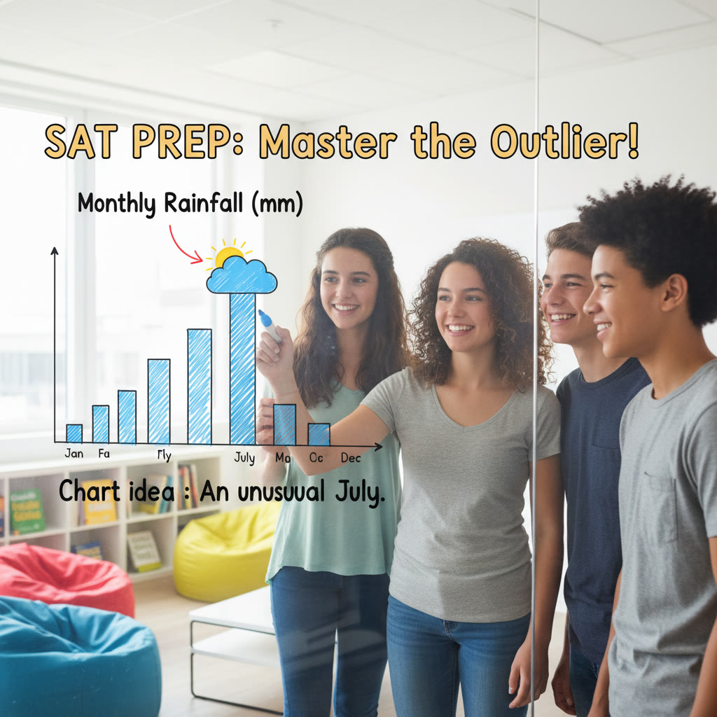
One more worked example: spotting an outlier
Suppose the passage discusses rainfall patterns in a tropical region. The bar chart shows monthly rainfall with one unusually high bar in September. A question asks: “Which of the following is best supported by the graphic?” One choice reads: “Rainfall is consistently high throughout the year.” Another says: “September had an unusually high rainfall compared to other months.” The correct choice is the second; don’t be tempted by a sweeping choice if the graphic shows one strong outlier.
Bringing it all together
Graphs and charts are simply another language the SAT uses. Once you accept that, you can learn the grammar: read labels, note trends, check scales, and match the graphic to the passage’s claims. Practice with realistic passages. Time your routines. Use small notes or digital highlights. If you find you’re consistently tripped up by the same mistake, consider targeted tutoring: Sparkl’s one-on-one sessions and AI-driven practice insights can create a short, efficient plan to convert your weak points into strengths.
With a calm and structured approach, these visual elements stop being surprise guests and become reliable allies on test day. You’ll move through them with confidence — and watch the points add up.


No Comments
Leave a comment Cancel