Why data-driven reading passages feel like a different language
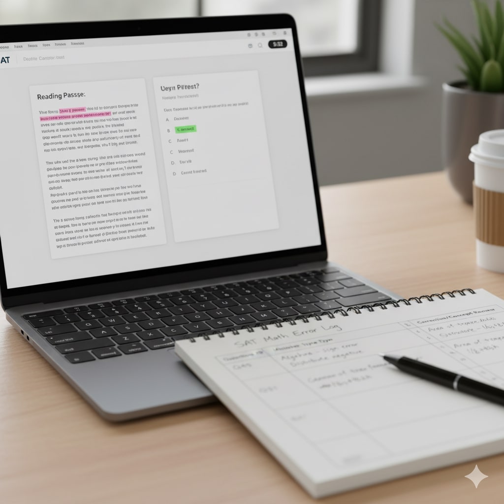
Walk into a modern Digital SAT reading section and you might find a paragraph, a chart, a small table, and a question that asks you to combine them. If that sentence made your stomach drop, you’re not alone. The Digital SAT increasingly weaves data (graphs, tables, infographics) into reading passages, asking you to read like a scientist and think like a critic. For many students that combination is unfamiliar and anxiety-producing.
What are “data-driven” reading passages?
Data-driven reading passages pair traditional prose with visual data. Instead of only evaluating a paragraph’s tone, structure, or evidence, the test expects you to interpret numbers, trends, and relationships and use them as evidence for an answer. You might be asked to judge whether a graph supports the author’s claim, to synthesize a table’s values with a paragraph’s argument, or to evaluate which piece of evidence is strongest.
Why this format trips students up
There are several overlapping reasons:
- New cognitive load: Interpreting visuals adds another layer of thinking. Many students have never practiced integrating textual reasoning with numerical interpretation under time pressure.
- Fear of math: Even simple charts can trigger math anxiety. If a student assumes they need advanced calculations, they avoid careful reading.
- Misreading what visuals show: Graphs can be deceptive. Scales, axes, and units matter — and students often skim them or make assumptions (e.g., assuming linear scale vs. logarithmic, or misreading a percentage as an absolute number).
- Surface focus on words: Many readers look for keywords or tone in the passage and neglect that the correct answer requires combining passage logic with data evidence.
- Time management: Adding visuals can increase time spent on a passage. Without a strategy, students get bogged down and rush answers.

Real-world examples that illuminate the challenge
Imagine a short passage arguing that local parks increase neighborhood well-being. Next to it: a table showing park usage hours by age group, and a bar graph showing survey responses about life satisfaction. Questions might ask which group’s usage best supports the author’s claim, or whether the survey data undermines the claim. Students who only read the text may miss the nuance — perhaps adults use parks the most but report lower satisfaction, which complicates the argument.
Or consider a passage about a scientific study’s findings, paired with a scatterplot. If the scatterplot includes outliers that dramatically affect the apparent correlation, a student who doesn’t notice them may choose the wrong answer. These are the small, testy traps that convert a plausible answer into an incorrect one.
How to think differently: a mindset shift
The first change is mental: data-driven passages need two simultaneous stances. Read like a reader and like a data analyst. Practically, that means:
- Respect the text: understand the author’s thesis, tone, and evidence.
- Respect the data: read axes, units, legends; ask what’s shown and what’s missing.
- Ask the meta-question: Does the data strengthen, weaken, or complicate the author’s claim?
When you practice this dual stance, you’ll stop seeing the graph as decoration and start seeing it as a co-author of the passage.
Clear, actionable strategies to conquer data-driven passages
Below are concrete habits and techniques that translate directly into better accuracy and faster response time on test day.
1. Read the visuals first (30–45 seconds)
Before you dive deep into the text, glance at the chart or table. Don’t do calculations yet — just identify:
- Type of visual (bar, line, scatter, table)
- Axes and units (e.g., years, percentage, counts)
- Any legends or categories
- Obvious trends, peaks, or outliers
This quick scan primes your brain to spot when the passage refers to data points.
2. Annotate purposefully
On paper or in your head, mark the author’s claim, the key evidence, and any hedges (words like “may,” “suggests,” or “appears”). When you look back at the data, annotate which parts of the visual match the author’s claims and which contradict them.
3. Translate visuals into short statements
Turn a graph into a sentence: “From 2010 to 2020, city A’s commutes decreased by roughly 15% while bicycle use rose steadily.” This makes it easier to compare the visual with the textual claims.
4. Watch for how the test uses data (support, nuance, or contradiction)
Questions rarely require elaborate math. Usually the test asks whether the data supports a claim, adds nuance, or contradicts. Look for answers that match that relational idea — not ones that simply repeat numbers.
5. Use elimination strategically
Many wrong answers are tempting because they echo a surface detail or assume more than the evidence allows. Cross out answer choices that require assumptions the passage or data doesn’t provide.
6. Keep calculations minimal and purposeful
If you need to compute, do it roughly. Estimate percentages, compare heights visually, or calculate a difference in whole numbers. The SAT rewards reasonable, well-justified answers over precise but unnecessary crunching.
7. Practice active skepticism
Ask: “Could the data be read differently? What’s missing?” Many passages intentionally include data that both supports and complicates the author’s claim; spotting that complexity is often the path to the correct answer.
Sample approach: step-by-step walkthrough
Let’s walk through a hypothetical question to see these strategies in action.
- Scan the visual: It’s a line chart showing average hours of sleep for adolescents from 2000 to 2020. There’s a steady decline from 9 to 7 hours.
- Read the passage: The author argues that device usage is the primary cause of the decline.
- Annotate: Note that the chart shows decline, but it doesn’t show device usage. It shows correlation with time.
- Question reads: “Which best describes the relationship between the chart and the author’s claim?”
- Evaluate choices: Eliminate ones that claim the chart proves causation (because it doesn’t show device usage), keep choices that say the chart is consistent with the claim but does not establish causation.
This method keeps you from falling into the common “correlation equals causation” trap.
Common traps and how to avoid them
- Trap: Choosing an answer that extrapolates beyond the presented data. Fix: Ask, “Does the passage or visual actually show that?” If not, eliminate it.
- Trap: Misreading scales. Fix: Always check the axes and units before judging trend size.
- Trap: Ignoring sample size or source. Fix: If the passage mentions sample limitations, factor that into your assessment.
- Trap: Letting math anxiety rush you into a guess. Fix: Use estimation and the context of the passage to guide your choice.
Practice that builds real skill (not busywork)
Not all practice is equal. The right practice builds the two muscle groups you need: careful textual analysis and calm interpretation of visuals. Here’s an effective routine:
- Daily micro-practice (15–20 minutes): one data-driven passage. Time it, but prioritize accuracy over speed at first.
- Weekly integration session (60–90 minutes): two or three passages back-to-back under timed conditions, followed by review and annotation of mistakes.
- Reflection journal: note the type of mistake (misread axis, jumped to causation, overlooked author tone) and one action you’ll take next time.
How tutoring and tailored support accelerate progress
Students often plateau because they repeat the same mistakes without focused feedback. This is where personalized tutoring is powerful. One-on-one coaching can identify stubborn habits — like skimming axes or trusting first impressions — and replace them with better defaults. Sparkl’s personalized tutoring, for example, offers tailored study plans, expert tutors who model the dual-reading stance, and AI-driven insights to track recurring errors. That combination of human feedback and data-informed practice speeds improvement more than unguided practice alone.
Quick reference table: common visual types and reading cues
| Visual Type | What to check first | Typical trap | Quick reading cue |
|---|---|---|---|
| Bar chart | Category labels and scale | Assuming equal intervals where they aren’t | Compare heights, not exact values |
| Line graph | Time axis and scale | Ignoring breaks or truncated axes | Look for trend direction and rate |
| Scatterplot | Correlation pattern and outliers | Overstating correlation from a cluster | Note slope and any outliers |
| Table | Rows/columns labels and units | Picking a single value as representative | Compare rows/cols for pattern |
Time management: balancing depth and speed
Students often feel they must read everything slowly to be precise, but that’s neither possible nor necessary. Use a tiered reading approach:
- Tier 1 (20–30 seconds): Scan visuals and headings to build context.
- Tier 2 (30–60 seconds): Read the passage and annotate thesis and evidence.
- Tier 3 (remaining time): Answer questions, returning to the passage/visual for confirmation only when needed.
With practice, this becomes an efficient rhythm: fast enough to finish, deliberate enough to avoid careless mistakes.
How to use practice tests most effectively
Full practice tests are invaluable, but the real gains come from smart review:
- Do one full timed test every 2–3 weeks to build stamina.
- After each test, review every wrong and every lucky guess. Write down why your initial choice was wrong and what the better clue was.
- Track patterns: are you consistently missing questions that require comparing data and text? Then set a focused micro-practice goal on that skill.
Motivation and mindset: turning mistakes into fuel
It’s easy to get discouraged by data-driven passages. They feel precise and unforgiving. Resist perfectionism. Mistakes are information, not indictment. Keep a short log of errors and celebrate when a previously recurring mistake stops appearing. That kind of feedback loop — try, fail, learn, improve — is the engine of real progress.

Putting it together: a 4-week mini-plan to level up
Here’s a compact, effective month-long routine (roughly five hours per week) to make data-driven passages feel normal.
- Week 1: Foundation — practice identifying visuals and translating them into short statements. 15 minutes daily.
- Week 2: Integration — work through paired text-and-data passages; practice the scan-text-evaluate loop. 30 minutes daily.
- Week 3: Speed and accuracy — timed sets, focusing on elimination strategies and annotation. 45–60 minutes, 4 days this week.
- Week 4: Full practice test and focused review; work on recurring mistakes. One full test + three targeted practice sessions.
If you have access to a tutor, ask them to model the annotation and reasoning aloud for the first two weeks. Hearing the thought process is often more valuable than checking answers alone. Sparkl’s individualized tutors, for instance, can demonstrate these thought patterns in a one-on-one setting and adapt the plan to your unique strengths and weaknesses.
Final words: confidence is a skill you practice
Data-driven reading passages on the Digital SAT are designed to test reasoning, not raw computational skill. With a few shifts in strategy — scanning visuals first, translating graphs into statements, annotating evidence, and practicing deliberately — these passages will stop being mysterious traps and become opportunities to show critical thinking. If you pair that disciplined practice with personalized support, like one-on-one guidance, tailored study plans, and tutors who give targeted feedback (plus AI-driven analytics to highlight patterns), your growth accelerates. Keep a gentle, curious mindset: every confusing chart you decode becomes one less thing to fear on test day.
Takeaway checklist
- Scan visuals before the passage.
- Annotate claim, evidence, and hedges in the passage.
- Translate data into a simple sentence.
- Ask whether the data supports, complicates, or contradicts the passage.
- Estimate rather than over-calculate.
- Review mistakes and track patterns — consider personalized tutoring to speed progress.
Ready to make data-driven passages feel like a playground instead of a minefield? Start small, stay consistent, and seek feedback that targets your specific habits. With practice and the right support, you’ll find these passages less intimidating and more rewarding — a direct chance to show the kind of clear thinking colleges value.


No Comments
Leave a comment Cancel