
Why data interpretation matters more on the Digital SAT
If you’re preparing for the Digital SAT, you might already know that the exam rewards clear thinking, efficient work, and the ability to reason from evidence. What many students underestimate is how often that evidence arrives as a chart, table, or short data prompt. The ability to read, interpret, and extract exactly what you need from data — quickly and accurately — can be the difference between a guess and a solid, bankable score.
Think of data interpretation as the translator between math concepts and real-world information. Instead of spending time deciphering what a question is asking, you want to sprint to the insight it hides. This blog unpacks why these skills boost SAT performance, how they show up on the test, and practical, high-impact ways to build them — with examples you can practice right away.
What the Digital SAT expects from you
The Digital SAT tends to favor analysis over rote computation. You’ll encounter passages, graphs, scatterplots, and tables that require you to:
- identify the right piece of information quickly;
- translate visual data into numbers or relationships;
- choose the simplest approach to reach a conclusion; and
- avoid traps built from plausible but incorrect interpretations.
When you sharpen data skills, you don’t just get faster — you get more accurate. That’s because many errors are not arithmetic mistakes but misreads: mixing up axes, ignoring labels, or working with rounded values when exact values are needed.
How data interpretation questions appear on the Digital SAT
On the Digital SAT, data can show up in several forms. Recognizing the form quickly lets you apply the most efficient strategy.
- Single-chart questions: a bar/line chart or pie chart. Usually asks for trend interpretation or comparisons.
- Table-based prompts: dense with numbers; the key is knowing which row or column matters.
- Multi-part data sets: multiple small visuals or a combo of text and table requiring cross-referencing.
- Contextualized data: data embedded in a word problem — economic figures, scientific measures, or survey results.
Quick example (typical Digital SAT style)
Imagine a line graph showing the monthly enrollment in two online courses over a year. A question asks: “Between which two months did Course A experience the largest percentage increase?” To answer efficiently, you don’t need every month’s exact value — you need to compare relative jumps and compute percentage change only for the top candidates.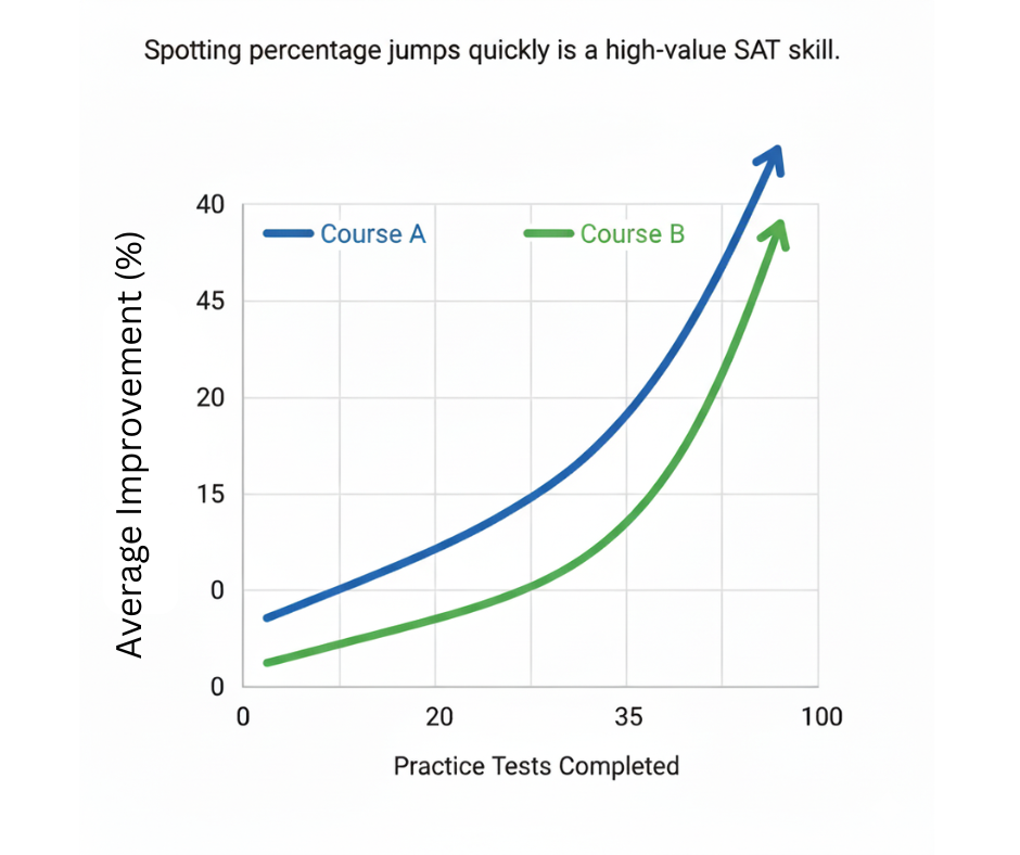
Why mastering data interpretation raises your overall score
There are three big reasons data prowess translates into higher SAT scores:
- Faster, more confident answers: When you can quickly decode what a chart or table shows, you spend less time second-guessing and more time answering other questions.
- Fewer careless errors: Many mistakes come from misreading scales or mixing up labels. Data-literate students catch those pitfalls early.
- Stronger evidence-based reasoning: The SAT rewards answers grounded in the passage or data given. If you can point to the exact cell, axis, or trend that supports your choice, you reduce reliance on memory or assumptions.
Real-world context: why this matters beyond the test
Data interpretation isn’t just an SAT trick. Whether you’re navigating science class, interpreting polls in a history lesson, or reading financial reports, these are lifelong skills. The SAT simply packages them in small, high-leverage problems so mastering them helps academically and professionally.
Foundational habits to build first
Before deep drills, cultivate these simple habits. They improve accuracy dramatically:
- Always read labels first: axes, units, footnotes, legends. This prevents confusion between percentage and absolute values, or between millions and thousands.
- Scan for anomalies: big jumps, outliers, and sudden dips often signal the correct answer or a trap.
- Estimate before computing: quick mental estimates help you eliminate clearly wrong choices and save time.
- Note rounding and precision: some SAT answers rely on rounded figures; decide whether an approximate answer is enough or exact work is required.
Short practice routine (10 minutes/day)
Build a daily habit that takes only ten minutes and yields steady gains:
- Pick one chart or table (from a practice test or a news graphic).
- Spend two minutes noting units, labels, and what the graphic is trying to show.
- Ask two predictive questions: “What is the biggest change?” and “What might be a misleading read?”
- Solve one targeted question and check your reasoning — not just the answer.
Strategies and tactics: how to attack data questions on test day
When a passage or chart pops up on the Digital SAT, follow this structured approach. It’s simple, repeatable, and powerfully effective under time pressure.
1) Skim for the correct frame
Identify whether the graphic shows counts, percentages, averages, or probabilities. The method for comparing averages is different from comparing rates or percentages.
2) Anchor to a reference
Choose a clear reference point — a baseline month, a median value, or a labeled pivot — and refer back to it. This reduces re-reading and avoids flipping between parts of the passage.
3) Convert visual to arithmetic only when needed
If you can compare visually (e.g., “this bar is clearly twice as tall”), use that to eliminate choices. Only compute exact values when the answers are close or when the question asks for a numerical result.
4) Watch for common SAT traps
Two traps repeat often:
- Axis manipulation: charts with non-zero baselines or compressed scales that exaggerate differences. Always check the y-axis origin and unit increments.
- Misleading averages: when distributions are skewed, the mean may not represent most data points. Look for what the question asks: mean, median, or range?
Worked examples: practice with purpose
Let’s walk through two examples that mimic the Digital SAT’s approach. These practice scenarios teach process over memorized formulas.
Example 1 — Table comparison (economics-style)
You’re given a table of quarterly sales for three product lines: A, B, and C. The question asks: “Which product had the greatest percent decrease from Q2 to Q3?”
Smart approach:
- Scan the two relevant columns (Q2, Q3).
- Estimate percent change by comparing the drop to the Q2 value: (Q2 – Q3) / Q2.
- Rather than compute three exact percentages, calculate for the strongest candidate(s) visually, then confirm if needed.
Example 2 — Scatterplot and trend
A scatterplot shows student study hours vs. test score for 50 students. A line of best fit slopes upward but flattens at higher hours. The question: “Which conclusion is best supported by the plot?”
Interpretation keys:
- Identify direction (positive association) and shape (diminishing returns at higher hours).
- Reject absolute causal claims: the plot suggests association, not necessarily causation.
- Look for whether the answer references a plateau — that’s a likely correct nuance.
Table: Comparison of common data question types and tactics
| Data Format | What to look for | Fast tactic | Common trap |
|---|---|---|---|
| Bar chart | Relative heights, axis labels | Estimate proportions visually; use axis increments only if choices are close | Non-zero baseline; stacked bars hiding parts |
| Line graph | Trends, slopes, inflection points | Compare slopes rather than exact values for trend questions | Time scale compression; misleading smoothing |
| Table | Exact values, headers, units | Isolate relevant rows/columns and compute only those values | Mixing units or overlooking footnotes |
| Scatterplot | Correlation strength, outliers | Note direction and consistency; check for clusters | Assuming causation from correlation |
Practice drills that produce real improvement
Practice only works when it’s deliberate. Follow these drills three times a week and track progress:
- One-chart sprint (15 minutes): Set a timer and answer five mixed chart questions. After each, write one sentence explaining why the correct answer is supported by the data.
- Table deep-dive (20 minutes): Take a dense table, create three questions yourself (comparison, percent change, and inference), then solve them.
- Explain aloud (10 minutes): Teach a friend or record yourself explaining what a chart shows and why an answer is correct. Teaching clarifies thinking.
Tracking metrics that matter
Measure two things: accuracy and time to first useful insight. Accuracy tells you whether your reads are correct. Time to insight tells you whether you’ll finish in the exam window. Trim time through practice, trim errors by double-checking labels and units.
How targeted tutoring accelerates learning (a natural fit)
Some students can self-correct with steady practice; others hit plateaus where personalized guidance makes a big difference. That’s where targeted tutoring — like Sparkl’s personalized approach — can help. A tutor can quickly diagnose whether mistakes are conceptual (misunderstanding percent change), procedural (performing computations inefficiently), or strategic (misreading axis labels under time pressure).
Sparkl’s 1-on-1 guidance and tailored study plans are useful because they focus on your specific errors and build practice that mirrors the Digital SAT’s style. Expert tutors can model efficient shortcuts, verify your reasoning in real time, and use AI-driven insights to prioritize the highest-impact drills. If you’re scoring in the 600s and want to push into the 700s, these are the kinds of refinements that produce points.
Time management: save minutes where it counts
Good data readers are also good time managers. Here are pragmatic tips to preserve minutes for hard problems:
- Answer what you can in the first pass. If a chart question looks straightforward, handle it now.
- Flag ambiguous data items for a second pass. Don’t let one tricky table clog the entire section.
- Use approximate reasoning to eliminate blatantly wrong answer choices fast.
- On multi-part data sets, carry forward a small note of the key numbers that matter so you don’t recompute repeatedly.
Time-saver example
If a question asks for a percent change between two numbers and the choices are spaced widely (e.g., 5%, 20%, 75%), estimate first: if the new value is roughly half the old value, you can instantly eliminate 5% and 20% and likely pick 50–75% range without exact calculation.
Common misconceptions and how to avoid them
Students often fall for a set of recurring misconceptions. Here’s how to notice and correct them:
- “Bigger number always means more important”: Not if units differ. Convert to the same unit before comparing.
- “The line shows causation”: Always ask whether the data was observational or experimental; the SAT rewards cautious language.
- “Outliers are noise”: Sometimes outliers are the point. Read the question: is it about central tendency or exceptional cases?
Putting it together: a 4-week plan to sharpen data interpretation
This compact plan is designed for busy students who want steady progress without burnout. Spend 30–60 minutes per session, 4–5 sessions a week.
- Week 1 — Foundations: Focus on labels, units, axes, and common chart types. Do one quick-chart session daily and one table session every other day.
- Week 2 — Strategic drills: Practice percent change, averages, and rate problems. Time yourself on five-question sets.
- Week 3 — Mixed sets: Simulate Digital SAT conditions with mixed chart-and-text prompts. Emphasize speed and justifications.
- Week 4 — Mastery and reflection: Take full practice sections, review errors in detail, and refine time allocation. Consider targeted tutoring sessions to iron out persistent mistakes.
Why a tutor helps in week 4
By week 4 you’ll have clear patterns in your mistakes. A tutor (for example, through Sparkl’s personalized tutoring) can convert those patterns into a focused, short-term curriculum: targeted exercises, micro-lessons on percent change or axis interpretation, and simulated practice under time constraints. That concentrated feedback loop shortens the path to mastery.
Tools and resources that complement practice
You don’t need fancy software to improve — consistent, reflective practice works best. Still, some tools accelerate learning:
- High-quality SAT practice questions that include charts and tables.
- Spreadsheet software for creating your own practice tables and calculating percent changes quickly.
- Timed drills with mixed data types to simulate test pressure.
- 1-on-1 coaching or small group sessions for targeted feedback.
Final tips and a realistic mindset
Data interpretation is a skill you can visibly improve in weeks, not years. Progress comes from consistent habits, targeted reflection, and practice that mimics the real test. Keep these closing ideas in mind:
- Quality over quantity: Ten well-reflected problems beat fifty rushed ones. After each practice, write a one-sentence reflection on what tripped you up.
- Move from reactive to proactive: Learn to anticipate traps (axes, units, outliers) so they stop being surprises on test day.
- Use feedback wisely: Whether from self-review, peers, or a tutor, focus on the three most common errors you make and eliminate them first.
A short checklist for test day
- Pause to read chart labels and units before reading answer choices.
- Estimate first; compute only when necessary.
- Watch out for non-zero baselines and compressed axes.
- When in doubt, choose the answer that is directly supported by the data, not the one that sounds most plausible outside the given information.
Wrap-up: make data interpretation your SAT advantage
On the Digital SAT, the students who win are not always the fastest calculators — they are the clearest thinkers. Data interpretation trains you to read evidence carefully, reason efficiently, and eliminate doubt. Those are skills that score points on the test and give you an advantage in school and beyond.
If you want an accelerated path, personalized guidance can compress months of trial-and-error into a few targeted sessions. Sparkl’s personalized tutoring model — with 1-on-1 guidance, tailored study plans, expert tutors, and AI-driven insights — is one example of how focused coaching can push your accuracy and speed forward when you’re ready to make a jump.
Start small, practice deliberately, and track two things: your accuracy on data questions and how long it takes you to get to the first solid insight. Improve those, and the rest of your Digital SAT will follow.
Good luck — read the axes, trust the evidence, and bring home the points.


No Comments
Leave a comment Cancel