Seeing the Score: Why Composition Matters for AP 2D Work
If you’re preparing an AP 2D portfolio or working toward the AP exam, composition is the invisible architecture that separates a good piece from a memorable one. Beyond pretty pictures, the College Board’s assessment of 2D design values how you use visual principles to communicate, solve problems, and create a coherent body of work. Think of balance, contrast, and rhythm as your three-pronged toolkit: together they form the language graders read to assess intent, skill, and conceptual strength.

A scoring mindset
When readers evaluate AP 2D work, they look for evidence that you understand—and can manipulate—visual language. That means composition choices should look deliberate, not accidental. Scorers are trying to answer: Does the composition support the idea? Is the arrangement of forms and spaces considered? Do visual strategies like balance, contrast, and rhythm strengthen the concept? If you can show purposeful decisions and consistent skill, your score reflects that clarity.
Balance: Not Just Symmetry—Equilibrium of Elements
Balance is how visual weight is distributed across a piece. It isn’t limited to mirror symmetry; it’s about creating stability or intentional tension. In AP 2D contexts, balance demonstrates control over how the viewer’s eye travels and where attention settles.
Types of balance and how they score
- Symmetrical Balance: Two halves mirror each other. It communicates formality and calm. Used well, it can show restraint and control—qualities graders appreciate when they align with your concept.
- Asymmetrical Balance: Different elements balance through contrast in size, value, texture, or color. This is often more dynamic and demonstrates nuanced problem solving—highly scored when executed deliberately.
- Radial Balance: Elements radiate from a center point. It’s strong for focal emphasis and is effective when the concept calls for circulation or centrality.
- Crystallographic (Allover) Balance: Repeated motifs provide even visual weight across a surface. This can score well in series work that emphasizes pattern and surface exploration.
In scoring terms, a composition that uses balance thoughtfully shows evidence of planning (sketches, studies, iterative choices). If your work demonstrates adjustments—cropping, scaling, or repositioning elements for better equilibrium—mention that in your portfolio statement for the AP reader. It signals intentionality.
Contrast: The Engine of Visual Interest
Contrast is how you make elements read against each other. It could be between light and dark (value), warm and cool (color), rough and smooth (texture), or big and small (scale). Contrast draws attention—used strategically, it creates hierarchy and narrative.
Contrast techniques to practice
- Value Contrast: High value contrast gives you immediate focal points. For AP work, control your lightest lights and darkest darks so they serve the idea rather than overwhelm it.
- Color Contrast: Complementary or saturated vs. desaturated color choices can pop a shape forward or tuck it back. Use color deliberately to separate planes or to create emotional tone.
- Textural Contrast: Pairing smooth painted areas with tactile collage or visible brushwork creates a tactile hierarchy—valuable in textured 2D portfolios.
- Scale Contrast: Drastically changing scale (tiny vs. enormous) can communicate theme—like vulnerability or dominance—powerful when aligned with concept.
Scorers reward contrast that supports communication. Randomly high-contrast elements that distract from the central idea can lower your effectiveness. Always ask: does this contrast move the idea forward?
Rhythm: Movement and Repetition That Guide the Eye
Rhythm in visual composition is about repetition, pacing, and the intervals between elements. It creates a visual tempo—fast, slow, steady, or syncopated. Rhythm allows you to choreograph how viewers experience a piece over time, an especially compelling skill for portfolios that include series or sequential works.
Ways to create rhythm
- Regular Rhythm: Predictable repeats—think rows of similar shapes—create calm and stability.
- Alternating Rhythm: A-B-A-B patterns introduce expectation and variation—effective for patterns with a twist.
- Progressive Rhythm: A sequence that changes gradually (size, color intensity) leads the eye spatially and conceptually through transformation.
- Random Rhythm: Intentionally irregular repetition can evoke organic systems or chaos—useful for thematic exploration when controlled by purpose.
In AP scoring, rhythm that connects works within a series can show conceptual unity. Even in a single piece, rhythmic strategies that enhance the viewer’s journey will be noticed.
Putting the Three Together: Compositional Strategies That Score
Balance, contrast, and rhythm are most powerful when layered. Consider how a bold contrast can be balanced by a counterweight elsewhere, or how rhythm can lead a viewer toward a high-contrast focal point. Below are pragmatic strategies you can apply during study and portfolio development.
Studio-friendly compositional checklist
- Start with thumbnails: test balance quickly in small sketches before committing to a final. Thumbnail variety = evidence of process.
- Define a dominant: pick one primary focal area and plan secondary supports. This clarifies hierarchy for the AP reader.
- Use contrast sparingly for emphasis: not every element needs to compete for attention.
- Control transitions: soften edges, gradations, or overlapping forms to guide movement between areas of contrast.
- Document decisions: photographs, numbered studies, and short notes strengthen your portfolio narrative.
Table: Composition Choices and Their Scoring Impact
| Compositional Choice | Visual Effect | How It Helps Your AP Score | Common Pitfall |
|---|---|---|---|
| Strong Asymmetrical Balance | Dynamic tension, sophisticated spatial relationships | Shows nuanced understanding of visual weight and problem solving | Appearing accidental if not supported by studies |
| High Value Contrast | Clear focal emphasis and readability | Demonstrates control of light and form; immediate clarity | Overuse creates visual fatigue or flattening |
| Progressive Rhythm | Sense of movement and transformation | Great for series; communicates conceptual development | Can feel contrived if progression lacks rationale |
| Textural Contrast | Tactile interest and depth | Shows technical range and surface exploration | May distract if unrelated to concept |
| Allover Patterning | Decorative unity and surface rhythm | Effective in sustained investigations; scores well if purposeful | Lacks hierarchy if everything is equally dominant |
Examples and Applied Exercises
Here are practical exercises you can do in the studio or during review sessions to build compositional fluency. Each one is designed to be short, repeatable, and directly tied to scoring considerations.
Exercise 1: Three-Thumbnail Challenge (15 minutes)
Create three small thumbnails for the same idea: one symmetrical, one asymmetrical, and one radial. Choose the strongest and refine it into a 20–30 minute study. When you submit to your portfolio, include the thumbnails and the study to show iterative thinking.
Exercise 2: Contrast Reduction (20–30 minutes)
Take a recent piece and create two variations: one where you double the value contrast and another where you halve it. Observe how each change affects hierarchy and mood. Take notes and photograph the three versions—this documentation speaks directly to your decision-making.
Exercise 3: Rhythmic Sequence (30–60 minutes)
Make a sequence of 4–6 small squares that progressively change one variable (size, color saturation, or texture). Arrange them in an unexpected layout and write a short caption explaining the conceptual rationale. This is excellent material for an AP series section.
How to Document and Present Your Compositional Choices
Scorers don’t just look at the final object—they look for evidence of thinking. Presentation is part of the message. Here’s how to translate your studio decisions into portfolio-ready evidence that aligns with scoring expectations.
Documentation best practices
- Include preparatory work: thumbnails, annotated studies, and photos of in-progress stages.
- Caption with intention: a 1–2 sentence note explaining why you made a compositional choice is more powerful than silence.
- Sequence logically: show progression when relevant—how an idea evolved compositionally across pieces.
- Consistent image quality: clear photos with neutral lighting keep focus on design decisions.
These steps help graders see you as a deliberate maker. Remember: scoring favors evidence that you’re testing, refining, and making purpose-driven changes—not just going with your first impulse.
Common Mistakes Students Make and How to Fix Them
Awareness is the first step to correction. Below are common pitfalls and clear, studio-ready fixes that will help improve composition with measurable results.
Mistake: Too Many Focal Points
Fix: Identify a primary focal point and reduce competing contrasts. Use color, value, or isolation to keep secondary elements supportive.
Mistake: Hesitant Balance
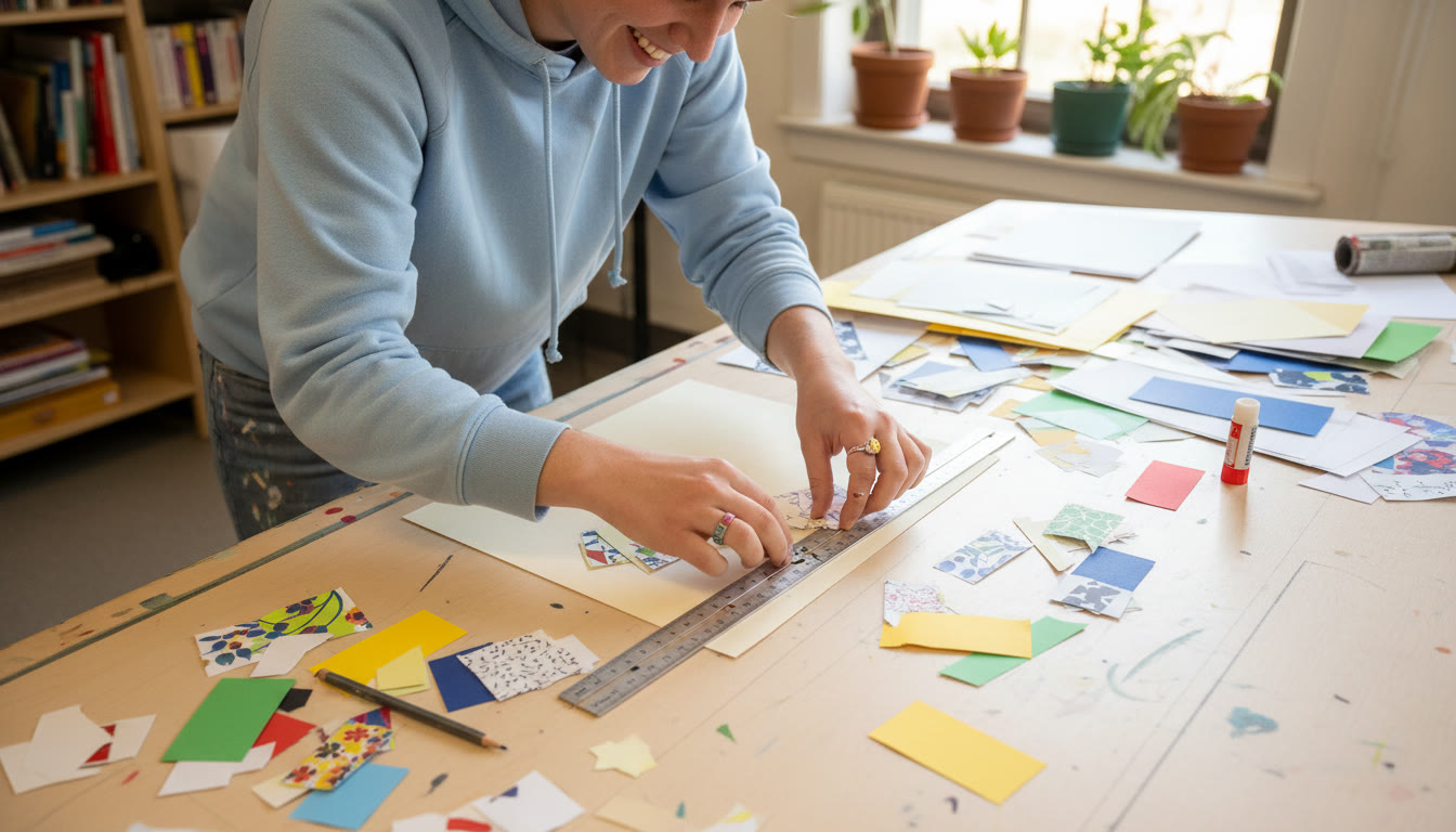
Fix: Physically move cut-paper studies or small objects around your work to find equilibrium. Photograph each arrangement and choose the one that best aligns with your concept—then note that choice in your portfolio.
Mistake: Rhythm Without Purpose
Fix: Ask how repetition supports your idea. If it’s merely decorative, refine it so the rhythm either emphasizes narrative or concept, or replace it with a more meaningful device.
How Tutoring and Targeted Feedback Boost Composition Skills
Objective feedback shortens the distance between experimentation and mastery. Working with a mentor—whether a teacher, peer, or a tailored service like Sparkl’s personalized tutoring—helps you translate visual intuition into scoreable decisions. Tutors can provide:
- 1-on-1 guidance on choosing effective compositional strategies for each piece.
- Tailored study plans that focus on your weak spots—whether it’s value control, dynamic balance, or rhythmic sequencing.
- Expert critique sessions that simulate AP reader feedback, plus actionable next steps.
- AI-driven insights to identify recurring habits in your work and suggest targeted exercises for improvement.
When tutoring is used as a tool for iterative refinement—coupled with intentional documentation—it can noticeably improve the quality and clarity of your portfolio pieces.

Case Study: From Sketch to Submission — A Hypothetical Walkthrough
Imagine a student, Maya, whose theme is “Urban Echoes.” She wants a 2D series that reflects repetition and decay in city fabric. Here’s how she might use balance, contrast, and rhythm to strengthen her scoreable narrative:
- Phase 1 — Thumbnails: Maya creates 12 thumbnails exploring asymmetrical layouts with repeating window motifs. She selects three that emphasize different rhythms.
- Phase 2 — Value Studies: She develops quick greyscale studies to test value contrasts and ensure the focal building reads against a noisy background.
- Phase 3 — Texture Tests: Maya experiments with scraped acrylic and collaged newsprint to create textural contrast representing decay.
- Phase 4 — Series Layout: She sequences six pieces to show progressive rhythm: a pristine façade morphs into increasing fragmentation. Each piece balances a dominant form with smaller supporting elements to maintain coherence.
- Phase 5 — Documentation: She photographs process stages, captions each with the compositional intention, and includes notes about adjustments made in response to critiques.
By the time Maya compiles her submission, her portfolio clearly demonstrates iterative compositional decisions, which is precisely what readers reward.
Exam-Day and Portfolio-Submission Tips
On the day you finalize your portfolio or take timed exams, compositional thinking needs to be fast and purposeful. These small habits yield outsized benefits.
Fast habits that help under pressure
- Always make at least three thumbnails—even under time constraints. This increases the chance your first composition is the best one.
- Use a value overlay (a grey-tinted sheet or a quick photo desaturated) to check focal clarity quickly.
- When you feel stuck, crop the work tightly—sometimes tightening the frame solves balance issues immediately.
- Keep a portable sketchbook for momentum—small directional decisions added up across weeks become portfolio strengths.
Final Thoughts: Composition as a Language You Can Learn
Balance, contrast, and rhythm aren’t just rules—they’re expressive tools. Applied thoughtfully, they become the means by which your ideas find clarity and emotional resonance. Scorers of AP 2D work are listening for evidence that you can purposefully manipulate those tools to support concept, demonstrate skill, and present a cohesive body of work.
If you pair sustained studio practice with targeted feedback—whether from teachers or tailored services like Sparkl’s personalized tutoring that offer 1-on-1 guidance, tailored study plans, expert tutors, and AI-driven insights—you’ll shorten the path from experimentation to confident, scoreable work. Compose with intention, document your decisions, and let compositional choices tell the story you want graders to read.
Quick Checklist Before You Submit
- Do your pieces show deliberate balance choices?
- Is contrast used to create a clear hierarchy?
- Does rhythm guide the viewer’s experience across the series or within the single work?
- Have you included process work and captions explaining your compositional decisions?
- Did you get feedback and iterate based on it?
Composition is an ongoing conversation between your idea and the techniques you use to express it. Keep practicing, keep documenting, and let each compositional choice be a sentence in the story your art is telling. Good luck—your next strong composition is one thoughtful decision away.


No Comments
Leave a comment Cancel