
Why Visuals Matter in AP Capstone
If you’ve ever stared at a page of numbers and felt your eyes glaze over, you already know the truth: people don’t read data so much as they scan for meaning. In AP Capstone—whether you’re writing AP Seminar essays, presenting your AP Research defense, or assembling a final report—your tables, graphs, and figures are the bridge between raw data and the story you want your reader or audience to understand.
Good visuals do three things instantly: orient, highlight, and persuade. They orient the reader by clarifying structure; they highlight the patterns you want to emphasize; and they persuade by making your argument easier to accept. The rest of this article gives you a practical, student-friendly toolkit for designing visuals that do those things well.
Start With Purpose: What Question Is Your Visual Answering?
Before you open spreadsheet software, ask a single, simple question: what specific question does this figure answer? This should decide the type of visual you choose and how you format it.
- Compare categories: Use bar charts or grouped bar charts.
- Show parts of a whole: Prefer stacked bars or a carefully labeled donut chart (avoid 3D effects).
- Show relationships: Use scatterplots with trendlines or correlation coefficients.
- Show change over time: Use line graphs; consider smoothing if data are noisy.
- Show exact values for reporting: Use well-formatted tables.
Keep that question visible when you design the visual—design decisions should be answers to that question, not stylistic whims.
Design Principles That Make Visuals Work
Clarity and Simplicity
Clarity beats cleverness. Remove gridlines that add noise, avoid default rainbow palettes, and only keep labels that aid understanding. White space is your friend: it directs attention and prevents overwhelm.
Prioritize Readability
Text size, axis labels, legends, and captions must be readable both on screen and printed. Use consistent fonts and make sure numbers are formatted sensibly (e.g., 1,200 vs 1200; 2.5% vs .025).
Use Color Intentionally
Color should encode meaning, not decorate. Pick a small palette (2–5 colors) that has good contrast and is colorblind-friendly—blue/orange palettes are often reliable. Use a muted tone for background data and a bright tone to highlight key series.
Label Everything That Could Be Misread
Every axis needs a label and a unit. Legends should be placed near the visual or the elements they describe. If a viewer could mistake a line or bar for something else, add a callout or annotation.
Choosing the Right Visual: Quick Guide
Here’s a condensed decision map you can print and stick to your notes.
| Question You’re Answering | Best Visual | When to Use |
|---|---|---|
| Which group scored higher? | Bar Chart | Comparing discrete categories (e.g., test sections, cohorts) |
| How did this metric change over time? | Line Graph | Trends across ordered time points |
| Are two variables correlated? | Scatterplot with Trendline | Assessing relationships or predictive patterns |
| What are the exact values? | Table | Reports, appendices, when precision matters |
| How are parts related to a whole? | Stacked Bar or Donut (sparingly) | Breakdowns of composition with few categories |
How to Build Each Visual: Step-by-Step
Bar Charts — Make Comparisons Immediate
Best practice checklist:
- Sort categories by value (descending) unless an order has meaning.
- Use horizontal bars if category names are long.
- Label each bar with its value when precise reading is likely.
- Group related bars and use subtle grouping separators if you have many categories.
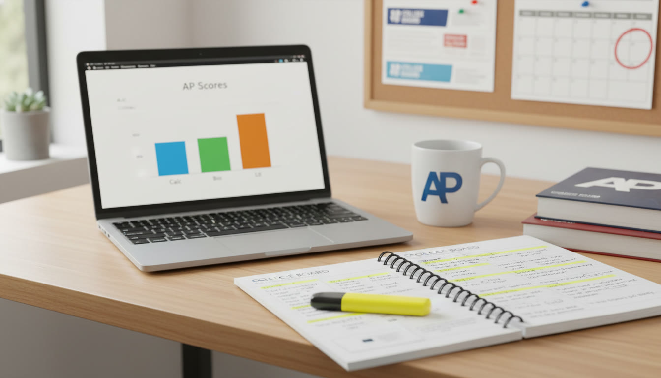
Example: If you’re comparing average scores across AP subjects, a horizontal grouped bar chart lets the reader compare both within and across years at a glance.
Line Graphs — Tell the Story of Change
Line graphs are great for showing trends, but they can mislead if axes are manipulated. Key rules:
- Start the y-axis at zero when the magnitude matters (unless you explicitly show a zoomed-in view and explain why).
- Use markers for sparse time points, solid lines for continuous data.
- For multiple series, keep colors and line styles consistent and annotate directly rather than using a distant legend.
Scatterplots — Reveal Relationships
Don’t forget to include the correlation coefficient (r) or R-squared when relevant, but explain what it means in plain language. Add a fitted line and a confidence band if you want to show uncertainty.
Tables — When Precision Wins
Tables are underrated. Use them when readers will look up exact numbers, like sample sizes, p-values, or group means. Make them readable:
- Align numbers on the decimal point.
- Group columns logically and use subtle shading to separate header rows.
- Limit the number of decimal places to what’s meaningful.
Figures and Photographs
When you include photos or diagrams, caption them clearly and refer to them by figure number in your text. The caption should answer: what is it, why it’s here, and what the reader should notice.
Annotation: The Secret Superpower
Annotations—arrows, short callouts, and shaded highlights—direct readers to the insight you care about. A single well-placed annotation often does more than a whole paragraph of explanation. Examples of effective annotation:
- Mark an outlier and briefly state why it matters.
- Highlight a sudden change in a time series and connect it to an event (e.g., “Policy introduced Q3 2019”).
- Use a bracket and label to show how two categories combine into a meaningful group.
Accessibility and Academic Rigor
Good visuals are accessible to all viewers. Keep these academic standards in mind:
- Provide alt text or a clear textual description for every figure in appendices or presentation notes.
- Use patterns in addition to color to differentiate series for colorblind readers (e.g., dashed lines, dot markers).
- Report uncertainty (confidence intervals, error bars) when you draw conclusions from sample data—AP graders and academic readers expect careful treatment of variability.
Common Pitfalls and How to Fix Them
Chartjunk
Too many effects—3D bars, unnecessary gridlines, flashy gradients—distract. If your reader remembers the distracting effect but not the data, you lost.
Misleading Axes
Truncated y-axes can exaggerate effects. If you must zoom in on a range, state it clearly in the caption and explain why it makes sense for your analysis.
Over-aggregation
Combining categories to simplify a chart can hide crucial differences. Use aggregation only with justification and consider an appendix table that shows the disaggregated numbers.
Putting It Together: Visuals Across an AP Capstone Project
Here’s a typical progression and how to use visuals at each stage:
- Literature Review: Use a tidy table summarizing key studies—year, sample, method, main finding.
- Methodology: Include a flowchart or diagram that shows sampling, instruments, and timeline.
- Results: Use bar charts and scatterplots to present primary findings and tables in the appendix for detailed numbers.
- Discussion: Use a simple before/after comparison figure or an annotated trend line to link evidence to interpretation.
Example: From Raw Data to Final Figure
Imagine you surveyed 300 students about study time and AP exam performance. Here’s a short workflow:
- Clean data: remove impossible values, check for missingness.
- Summarize: compute mean study hours and mean score by subject.
- Visualize: a scatterplot of study hours vs. exam score with a fitted line and R-squared; a grouped bar chart comparing means across subjects.
- Annotate: call out a strong positive slope and any clusters or outliers.
In your report, you might include the detailed table in an appendix and bring the two polished visuals into the main text to support your argument about study habits and performance.
Sample Table: Survey Summary (Illustrative)
| Subject | n | Mean Study Hours Per Week | Mean Exam Score | Std. Deviation (Score) |
|---|---|---|---|---|
| AP Biology | 68 | 6.4 | 81.2 | 8.7 |
| AP Calculus | 72 | 7.1 | 79.6 | 10.3 |
| AP English | 60 | 5.2 | 83.5 | 7.8 |
| AP US History | 100 | 4.8 | 76.9 | 11.2 |
Polish: Captions, Numbering, and Appendices
Number your figures and tables (Figure 1, Table 1) and refer to them explicitly in the text. Each caption should be concise but informative: what the reader is looking at, what was measured, and the key takeaway in one sentence. Put raw or very detailed tables in appendices so your main narrative stays uncluttered.
Practice Exercise: Create an Insightful Figure
Try this short exercise and compare your result to a peer’s:
- Collect a small dataset (e.g., average weekly study time vs exam score for 30 students).
- Decide the single question your figure answers.
- Create two visuals: a table and a scatterplot with annotations.
- Write a one-sentence caption for the scatterplot that includes the key number (e.g., correlation coefficient).
Then swap with a classmate and ask: does the visual answer the stated question within five seconds? If not, iterate.

Where Tutoring and Tailored Feedback Help Most
Designing effective visuals is a skill that improves with focused feedback. Working 1-on-1 with a tutor can accelerate that growth—especially when the tutor provides tailored study plans, annotates your drafts, and suggests presentation-ready refinements. Personalized tutoring platforms that pair expert tutors with AI-driven insights can also help you identify recurring issues (like inconsistent labeling or misleading axes) and track improvement over time. If you’re preparing an AP Capstone submission or defense, a targeted session on figure design can dramatically improve clarity and impact.
Final Checklist Before Submission or Presentation
- Does every figure have a clear, informative caption and a number?
- Are axes labeled with units and readable font sizes?
- Is the color palette consistent and accessible?
- Are uncertainty measures (error bars, confidence intervals) reported when appropriate?
- Have you annotated the main insight so the reader sees it within five seconds?
- Is the raw data or detailed table available in an appendix for verification?
Closing Thoughts
Visuals are storytelling tools. A well-made table, chart, or figure takes the reader by the hand and leads them to the conclusion you want to make—without forcing them to work to get there. For AP Capstone students, mastering visual communication not only improves grades; it strengthens your ability to think critically about data, to defend your claims persuasively, and to present your work with professional polish.
Build visuals with purpose. Annotate with intent. And when you want faster progress, consider focused, personalized support—thoughtful 1-on-1 coaching and tools that highlight where your visuals can be clearer will save time and sharpen your argument. Take the time to craft visuals that don’t just present data but tell a convincing, honest story.


No Comments
Leave a comment Cancel