Why build your SAT prep planner in Google Sheets?
There’s something quietly powerful about a spreadsheet that’s built by you, for you. Google Sheets is flexible, free (if you have a Google account), cloud-based, and accessible across laptop, tablet, and phone. Unlike rigid apps, a sheet can grow with your needs: track tests, log practice problems, color-code weak areas, calculate projected scores, and even visualize your momentum with charts.
Most importantly, a planner you build becomes yours. It reflects how you study, what matters to you, and how you respond to feedback. That ownership makes it far more likely you’ll keep using it—consistency is the single biggest driver of score gains on the SAT.
Overview: What your SAT prep planner should do
Before we jump into cells and formulas, outline the planner’s job. At a minimum it should:
- Capture a weekly schedule and daily study blocks.
- Log every practice test and practice session with scores, topics, and time spent.
- Highlight your weakest content areas and track improvement.
- Translate raw practice into a projected score and target actions.
- Provide simple visual cues: progress bars, trend lines, and color-coded priorities.
Once you agree on these goals, everything else—formulas, conditional formatting, charts—serves that mission.
Step 1: Create the structure—tabs and basic columns
Set up a new Google Sheet and create these tabs (sheets):
- Dashboard
- Weekly Schedule
- Practice Log
- Diagnostics (topic-level)
- Test Simulations
This separation keeps complexities manageable. The Dashboard will pull summaries from the others so you can glance at progress in 10 seconds.
Weekly Schedule sheet
Columns to include:
- Date
- Day
- Time Block (start-end)
- Activity (e.g., Math: Algebra, Reading: Passage Practice)
- Priority (High/Medium/Low)
- Status (Planned/In Progress/Completed)
- Notes
Practice Log sheet
This is the heart of your feedback loop. Columns to include:
- Date
- Type (Practice Test, Section, Drill, Flashcards)
- Content (Geometry, Heart of Algebra, Command of Evidence, etc.)
- Time Spent (minutes)
- Correct / Total (e.g., 18/20)
- Percent Correct (formula)
- Weighted Score Estimate (optional)
- Notes / Mistake Type
Diagnostics sheet
Use this to record topic-level accuracy so you can prioritize. Typical columns:
- Topic
- Attempts
- Correct
- Percent Correct (formula)
- Target Plan (what to review)
Test Simulations sheet
Record full practice tests here. Important columns:
- Date
- Official SAT Practice Test #
- Raw Evidence-Based Reading & Writing (ERW) Score
- Raw Math Score
- Scaled ERW
- Scaled Math
- Total Scaled Score
- Notes: pacing, stamina, environment
Step 2: Useful formulas and how to set them up
Here are practical formulas that will save time. Put formulas into the header row where relevant and copy them down.
Percent correct (Practice Log)
Assuming Correct is column E and Total is column F, use:
=IF(F2=0, “”, E2/F2)
Format that cell as a Percent. This protects against division-by-zero and leaves blanks when no data exists.
Monthly time spent (summary)
On the Dashboard you can sum time for the current month. If Practice Log has date in A and Time in D:
=SUMIFS(PracticeLog!D:D, PracticeLog!A:A, “>=”&DATE(2025,9,1), PracticeLog!A:A, “<="&DATE(2025,9,30))
Replace month/year with cell references for a dynamic summary.
Track weak topics (Diagnostics)
To get percent correct per topic if Correct is C and Attempts is B:
=IF(B2=0, “No data”, C2/B2)
Projected scaled score (simple linear estimate)
Scaling differs by test, but a quick projection helps prioritize. If you have historical mapping or want a rough estimate, convert practice raw scores using a mapping table (small two-column sheet mapping raw → scaled) and then use VLOOKUP or approximate lookup:
=VLOOKUP(RawScore, ScaleMapping!A:B, 2, TRUE)
This uses an approximate match so your mapping only needs breakpoints.
Step 3: Conditional formatting for visual clarity
Color is your friend. Use conditional formatting to make weak topics scream at you without being noisy.
- Percent Correct < 60% → light red background
- Percent Correct 60–79% → amber
- Percent Correct ≥ 80% → green
- Upcoming study sessions within 24 hours → highlight in blue
In Google Sheets, use Format → Conditional formatting and apply to your range. Use custom formulas for date-sensitive highlights, e.g.:
=AND($A2-TODAY()<=1, $G2=”Planned”)
This highlights planned sessions happening tomorrow or today.
Step 4: Drop-downs, data validation, and controlled inputs
Controlled inputs reduce typing and errors. Create lists for Activity, Topic, Priority, and Status on a separate sheet called “Lists.” Then apply Data → Data validation and choose the range. That gives you neat dropdowns and keeps your analytics clean.
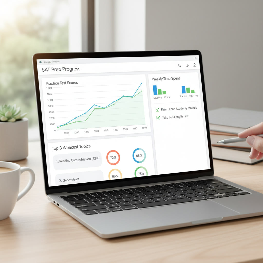
Step 5: Build a Dashboard: the at-a-glance view
The Dashboard should answer a few simple questions instantly:
- How many hours did I study this week?
- What are my three weakest topics right now?
- How did my last three full-length tests trend?
- Am I on track with my target test date?
Use these widgets on the Dashboard:
- Total study time (SUM or SUMIFS)
- Average percent correct for last 30 days (AVERAGEIFS)
- Top 3 weakest topics (SORT + FILTER or use SMALL with INDEX)
- Trend chart of scaled scores over time (Insert > Chart)
Example: Top 3 weakest topics formula
If Diagnostics has Topic names in A and Percent in D, you can use a small array formula to list the three lowest percents. If you prefer a manual approach, sort the Diagnostics sheet by Percent ascending and reference the top rows from the Dashboard.
Step 6: Charts that tell a story
Charts make trends obvious. The most useful ones:
- Line chart for practice test scaled scores (x-axis = date, y-axis = score)
- Stacked bar chart for weekly hours by category (Math vs. Reading)
- Donut chart showing distribution of errors by topic
Keep charts simple. A messy chart confuses more than it helps.
Step 7: Sample tables and templates you can copy
Below is an example Practice Log table you can reproduce. The table shows how you might record three practice rows and how formulas fit into the columns.
| Date | Type | Content | Time (min) | Correct | Total | Percent | Notes |
|---|---|---|---|---|---|---|---|
| 2025-09-01 | Section | Heart of Algebra | 40 | 15 | 20 | 75% | Pacing issues on multi-step questions |
| 2025-09-03 | Drill | Command of Evidence | 25 | 18 | 20 | 90% | Strong on inference |
| 2025-09-07 | Full Test | Official Practice Test 2 | 180 | 110 | 154 | 71% | Fatigue during final math section |
The Percent column uses the formula =IF(F2=0, “”, E2/F2) and is formatted as a percent. The Full Test row shows how you might log raw counts for the whole test.
Step 8: Advanced techniques: automation and Apps Script
If you want to automate reminders or create a weekly snapshot email, Google Apps Script can help. A simple script can do tasks like:
- Send a weekly summary to your email (hours studied, latest test score)
- Copy next week’s schedule from a template
- Populate a daily checklist each morning
Apps Script is JavaScript-like and plays well with Sheets. Start small—test a script that adds a timestamp when you mark a session Completed.
Step 9: Use study science to shape the plan
Spreadsheets are great, but the plan must reflect how learning works. Two evidence-backed ideas to embed:
Spaced repetition
Schedule reviews of a topic at increasing intervals. In your Weekly Schedule, add a column called “Review Round” (1, 2, 3…). Use conditional formatting to remind you when a topic is due for its next round.
Interleaving and mixed practice
Rather than doing long blocks of only one topic, mix problem types within a session. In your Weekly Schedule, mark a session as “Mixed” and list three mini-topics. Research shows mixing helps transfer and recall when test-day questions don’t come in nice, labeled boxes.
Step 10: Practical pacing: schedule, simulate, adjust
Pacing is both about time and mental endurance. A few practical rules:
- One full practice test every 1–2 weeks while you’re intensively studying; scale back closer to test day to simulate timing and stamina.
- Daily micro-sessions (25–50 minutes) improve consistency. Try the Pomodoro technique: 25 minutes focused, 5 minutes break, repeat.
- Use your Practice Log to compare planned vs actual time. If you consistently underestimate, add buffer time to future sessions.
Real-world example: how a student used the planner
Emma, a junior with a goal of 1400, started with a baseline test of 1200. She created a planner with the tabs above and used Diagnostics to identify weak areas: Algebra and Data Analysis. She scheduled two focused math days each week, interleaved with reading drills.
Within six weeks, Emma logged three full-length tests in the Test Simulations sheet and used the Dashboard to view a trendline. The chart showed steady improvement: 1200 → 1280 → 1350 → 1420. She also used conditional formatting to ensure any topic under 65% turned orange, prompting immediate review.
Emma reached her goal with a combination of consistent practice, targeted review based on Diagnostics, and one-on-one help when she couldn’t break through a recurring error type—in her case, negative numbers in multi-step algebra problems. Personalized tutoring was a natural fit for those sticking points; when she met with a tutor she received tailored strategies and pacing advice that she then recorded in her Notes column to replicate later.
How to make your planner feel personal (and sustainable)
A planner is only useful if you want to use it. Here are small touches that increase long-term use:
- Add an inspiring but short goal statement at the top of the Dashboard (e.g., “Score 1400 by March; focus: timing and algebra” ).
- Use a small daily checkbox or emoji in the Schedule to mark completion—visual satisfaction matters.
- Keep a short weekly reflection cell: 2–3 sentences about what worked and what didn’t.
- Periodically share your Dashboard with a mentor or tutor for accountability. If you work with a service like Sparkl’s personalized tutoring, your tutor can review the sheet to tailor sessions—bringing 1-on-1 guidance, tailored study plans, expert tutors, and AI-driven insights to accelerate progress.
Troubleshooting: common issues and fixes
- My numbers are messy: Use consistent dropdowns and clean data in “Lists” to prevent typos.
- Formulas return errors: Wrap calculations with IFERROR or IF checks to keep the sheet readable.
- Charts look odd: Ensure dates are true date values and not text—use DATEVALUE if needed.
- I forget to update it: Add a daily reminder in your phone or use Apps Script to send a morning digest.
Image suggestions


Final checklist: get your planner ready in one sitting
If you want to set this up quickly, follow this checklist:
- Create the five tabs (Dashboard, Weekly Schedule, Practice Log, Diagnostics, Test Simulations).
- Populate Lists with your topics, activity types, and priorities.
- Enter your last practice test and 1–2 recent sections into Practice Log.
- Set up conditional formatting for Percent and upcoming sessions.
- Create one chart for score trend and one for weekly time distribution.
- Write a short goal on the Dashboard and add a reflection cell.
Parting thoughts
Building an SAT prep planner in Google Sheets is both a practical and empowering step. It turns abstract ambitions into measurable actions. The first version won’t be perfect, and that’s fine—tweak it as you collect data. The real magic happens when your planner becomes a feedback loop: measure, reflect, adjust, practice.
Finally, remember that tools are most effective when paired with good guidance. If you ever need targeted explanation of a recurring mistake, personalized tutoring—such as the one-on-one guidance and tailored study plans offered by Sparkl—can help you turn stubborn weaknesses into strengths. Use your sheet to capture the work, and use tutors and mentors to sharpen the strategy behind the numbers.
Now take a deep breath, open a new Google Sheet, and build the planner that will carry you to your target score. Small daily progress compounds—let your spreadsheet be the map that shows it.


No Comments
Leave a comment Cancel