
Why Visual Abstracts Matter for AP Science Students
Imagine walking into your AP Biology or AP Physics class and seeing a poster that tells a whole experiment’s story in 60 seconds. That’s the power of a visual abstract: a compact, well-designed poster or slide that packages hypotheses, methods, results, and takeaway messages into something your brain can grasp instantly. For AP students preparing lab reports, science projects, or oral presentations, mastering visual abstracts is a practical skill that improves understanding, grades, and confidence.
From Dense Text to Instant Clarity
Traditional lab reports are great for detail, but they aren’t always efficient for communication—especially in a classroom, science fair, or AP Research presentation. A visual abstract translates complexity into clarity. It helps you: prioritize the evidence, show relationships between variables, and highlight the central claim. For exam-driven students, that clarity often translates directly into better study sessions and higher scores.

What a Visual Abstract Should Include
Think of a visual abstract as a micro-narrative of a scientific investigation. The typical components—kept short and visually distinct—are:
- Title: A concise, informative phrase (not a full sentence).
- Question or Hypothesis: What you tested and why it matters.
- Methods (brief): Key details—sample size, variables, assay, or apparatus—in icons or one-liners.
- Results: One or two charts, a summary statistic, or a clear visual comparison.
- Conclusion / Takeaway: The direct interpretation of results, and if applicable, the real-world implication.
- Limitations: One short line acknowledging major caveats.
- Call-to-Action or Future Direction: What should come next (optional but powerful).
Why These Elements?
Each element serves a purpose: the title hooks, the hypothesis orients, the methods reassure credibility, the results convince, and the conclusion delivers the message. Even in AP assessments where deeper prose is required, this structure trains you to think hierarchically—what belongs in the headline versus what belongs in the appendix?
Design Principles: Form That Follows Function
Good design isn’t decoration. It’s a tool for comprehension. Use the same principles that scientists and science communicators use when they publish: prioritize readability, emphasize the data, and reduce noise.
Key Design Rules
- Hierarchy: Use sizing and color contrast so the eye sees the title, the results, then the details.
- Simplicity: Limit fonts to two complementary choices and keep color palettes to 3–4 hues. High school science isn’t an art contest—clarity wins.
- Whitespace: Let elements breathe. Crowding makes the brain skip content.
- Consistent Iconography: Reuse simple icons for methods, participants, or instruments to create instant recognition.
- Readable Charts: Axes labeled, units shown, and colors chosen for accessibility (colorblind-friendly palettes when possible).
Step-by-Step Workflow for Creating a Visual Abstract
Follow this workflow for consistent, high-quality posters and slides—perfect for classroom presentations, AP Research portfolios, or science fair displays.
1. Distill the Message (15–30 minutes)
Write one sentence that answers: What did I test, and what did I learn? Then convert that into a 10–15 word title. This constraint forces you to prioritize the most important scientific claim.
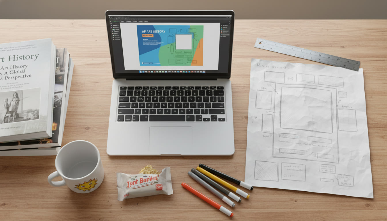
2. Sketch a Layout (10–20 minutes)
Paper or tablet—draft the placement of title, hypothesis, left-to-right or top-to-bottom flow, where the main graph will sit, and where you’ll place a short conclusion. Keep proportions in mind: people typically scan the top-left first.
3. Choose or Create Visuals (30–90 minutes)
Pick one primary data visualization (bar chart, scatter plot, line graph) and maybe one secondary visual (schematic or photo). Convert raw numbers into annotated visuals—highlight effect sizes and significant comparisons rather than presenting raw tables without commentary.
4. Write Microcopy (20–40 minutes)
Rewrite your labels and captions to be concise and active: “Temperature increase reduced enzyme activity by 35%” rather than passive paragraphs. Use bullets for methods.
5. Iterate and Test (30–60 minutes)
Show your draft to a peer or family member who isn’t in the class. If they can explain your finding back to you in a sentence, you’ve succeeded.
Practical Examples Tailored to AP Classes
Here are three short examples of visual abstracts adapted to typical AP investigations. These templates make it easy to copy the structure and substitute your data.
AP Biology — Enzyme Activity
- Title: “Heat and Catalysis: How Temperature Changes Affect Amylase Activity”
- Methods: 3 temperature treatments (10°C, 25°C, 40°C); n = 5 per group; substrate: starch assay; measured product concentration at 10 minutes.
- Results (visual): Bar chart showing mean product concentration with error bars; largest drop at 40°C.
- Conclusion: Optimal activity at 25°C; denaturation evidence at 40°C; recommend additional trials around 30°C.
AP Chemistry — Reaction Rates
- Title: “Concentration vs. Speed: The Kinetics of Acesol Reaction”
- Methods: Varying initial [reactant] (0.1 M, 0.2 M, 0.4 M); monitored absorbance at 500 nm every 30 s.
- Results (visual): Line graph of concentration over time; second-order kinetics suggested by linearized plot.
- Conclusion: Rate ∝ [reactant]^2; suggests bimolecular reactive step.
AP Environmental Science — Water Quality
- Title: “Runoff and Nitrate: Comparing Three Local Streams”
- Methods: Monthly sampling, nitrate concentration (mg/L), land use mapped for each watershed.
- Results (visual): Map inset + boxplots comparing nitrate levels; urban watershed shows higher median nitrate.
- Conclusion: Urban runoff correlates with elevated nitrate—policy implications for stormwater management.
Simple Table: Visual Abstract Checklist and Grading Rubric
Use this checklist as a self-evaluation or teacher rubric. Score each category from 0–4 (0 = missing, 4 = excellent).
| Category | What to Look For | Why It Matters |
|---|---|---|
| Title | Concise, informative, 10–15 words | Focuses audience immediately |
| Hypothesis / Question | Clear, testable statement | Provides experimental direction |
| Methods | Key variables, sample size, protocol shorthand | Establishes credibility |
| Results | One primary visual, labeled axes, units | Shows evidence; supports conclusion |
| Conclusion | Clear takeaway and implication | Turns data into meaning |
| Design & Readability | Hierarchy, color, spacing | Makes the message accessible |
| Limitations | One line acknowledging key caveat | Demonstrates scientific humility |
Data Visualization: Choosing the Right Chart
Charts aren’t interchangeable. The wrong chart can hide a pattern; the right one reveals it. Match your question to the chart type:
- Comparison: Bar charts or grouped bars (compare treatments).
- Trend over time: Line graphs (time-series).
- Relationship between two continuous variables: Scatter plots with best-fit line.
- Distribution: Boxplots or histograms (show spread and outliers).
- Composition: Stacked bars or pie charts (used sparingly—pie charts often mislead).
Annotate with short captions and arrows to call out the most important pattern. For AP graders and fair judges, annotated visuals are easier to evaluate quickly.
Communicating Uncertainty—A Scientific Superpower
AP science emphasizes evidence and reasoning, and part of reasoning is communicating uncertainty. Include confidence intervals, standard error bars, or note p-values if appropriate. A short note like “n = 5; error bars = SEM” shows you understand that single measurements don’t equal proof.
Practice Exercises and Mini-Projects
Practice turns skills into muscle memory. Try these mini-projects over a weekend or as AP class assignments:
- Create a visual abstract for a classic AP experiment (e.g., enzyme kinetics or osmosis). Limit yourself to a single slide.
- Redo a lab report’s introduction and conclusion into one visual poster. Share it with classmates for peer feedback.
- Analyze a dataset from a class experiment and prepare two visual abstracts: one for scientists (detail-oriented) and one for the general public (lay-friendly). Compare which decisions you made differently.
Assessment Tips: What Teachers and AP Readers Notice
When teachers or AP readers evaluate visual abstracts, they’re often looking for evidence of scientific thinking more than graphic design prowess. They want to see logical flow, appropriate controls, correct interpretation of the data, and honest discussion of limitations. In short: show them you understand both the experiment and the implications.
Tools and Technologies—From Low-Tech to High-Tech
Start simple. A clear poster can be made with paper, markers, and patience. As you want to scale up, use slide editors, spreadsheet graphing tools, or free data-visualization apps. The key is not the software but how well you translate numbers into clear visuals.
Low-Tech
- Hand-drawn schematics and labeled photos—perfect for tactile learning and fairs.
- Printed charts pasted onto poster boards—simple, effective, and often more readable at distance.
Mid-Tech
- Slide software for a clean, modular layout when presenting digitally.
- Spreadsheet charts with manual polishing (annotations, color choices).
High-Tech (When Appropriate)
- Vector graphic editors and data-visualization platforms for publication-style posters.
- Interactive dashboards for online sharing (useful for extended AP Research projects).
Time Management: Building a Visual Abstract Without the Last-Minute Panic
Good work takes time. Split the creation across multiple sessions to avoid mistakes:
- Day 1: Distill message and sketch layout.
- Day 2: Generate charts and write microcopy.
- Day 3: Polish design and test with peers—print a draft if it’s a poster.
This schedule leaves room for additional trials, which are often the difference between “looks okay” and “clear and convincing.”
How Tutoring Can Help: Sparkl’s Personalized Touch
Design and scientific judgment are complementary skills. If you or your student needs targeted help—whether it’s refining a hypothesis, choosing the right statistical display, or practicing a presentation—personalized tutoring can accelerate progress. Services like Sparkl offer 1-on-1 guidance, tailored study plans, and expert tutors who can give iterative feedback on drafts. Their AI-driven insights can also highlight common design pitfalls and suggest data-clarifying edits that save time and raise the quality of your visual abstract.
Common Mistakes and How to Avoid Them
- Too much text: If your poster reads like an essay, you’ve lost the point. Replace paragraphs with bullets and annotated visuals.
- Poor labeling: Always label axes with units. A chart without units invites confusion and lost credit.
- Misleading scales: Truncated axes or inconsistent scales can exaggerate effects—stick to honest representation.
- Ignoring audience: A poster for scientists vs. parents vs. classmates will require different language. Adjust accordingly.
- No limitations: Overconfident claims are often penalized; one line about limitations earns credibility.
Final Checklist Before Submission or Presentation
Run through this final checklist aloud—if you can explain your whole study in 60 seconds using your visual abstract, you’re ready.
- Title succinctly states the main finding.
- Hypothesis and methods are visible and unambiguous.
- Primary result is easy to spot and labeled correctly.
- Conclusion directly flows from the presented evidence.
- Limitations and sample size are noted.
- Design is legible from a normal viewing distance for posters or at typical device sizes for slides.
Wrapping Up: The Long-Term Benefits of Learning to Visualize Evidence
Creating visual abstracts is more than a school assignment—it’s training in scientific thinking and communication. These skills carry beyond AP classes: they make lab reports clearer, help you give sharper presentations, and train you to evaluate evidence critically. For parents, this skill set translates into better project outcomes, higher grades, and a student who can confidently explain complex ideas to any audience.
Take small steps: start with a single experiment, keep the visuals honest, and iterate. If you’d like structured feedback, consider pairing practice with targeted help—personalized tutoring that focuses on argument clarity, data visualization choices, and presentation skills can be a fast track to mastery. With practice, your visual abstracts won’t just summarize evidence—they’ll tell convincing scientific stories.
Now: pick an experiment, sketch your first layout, and let your data speak.


No Comments
Leave a comment Cancel